


 17Feb
17Feb
How to find a website designer for your small business?
If you own a small business, you’ve probably heard the advice that you need a website. So how do you turn that idea into a...

Different colors have their own emotional characteristics. Reasonable use of colors can enhance the visual impact of the design:
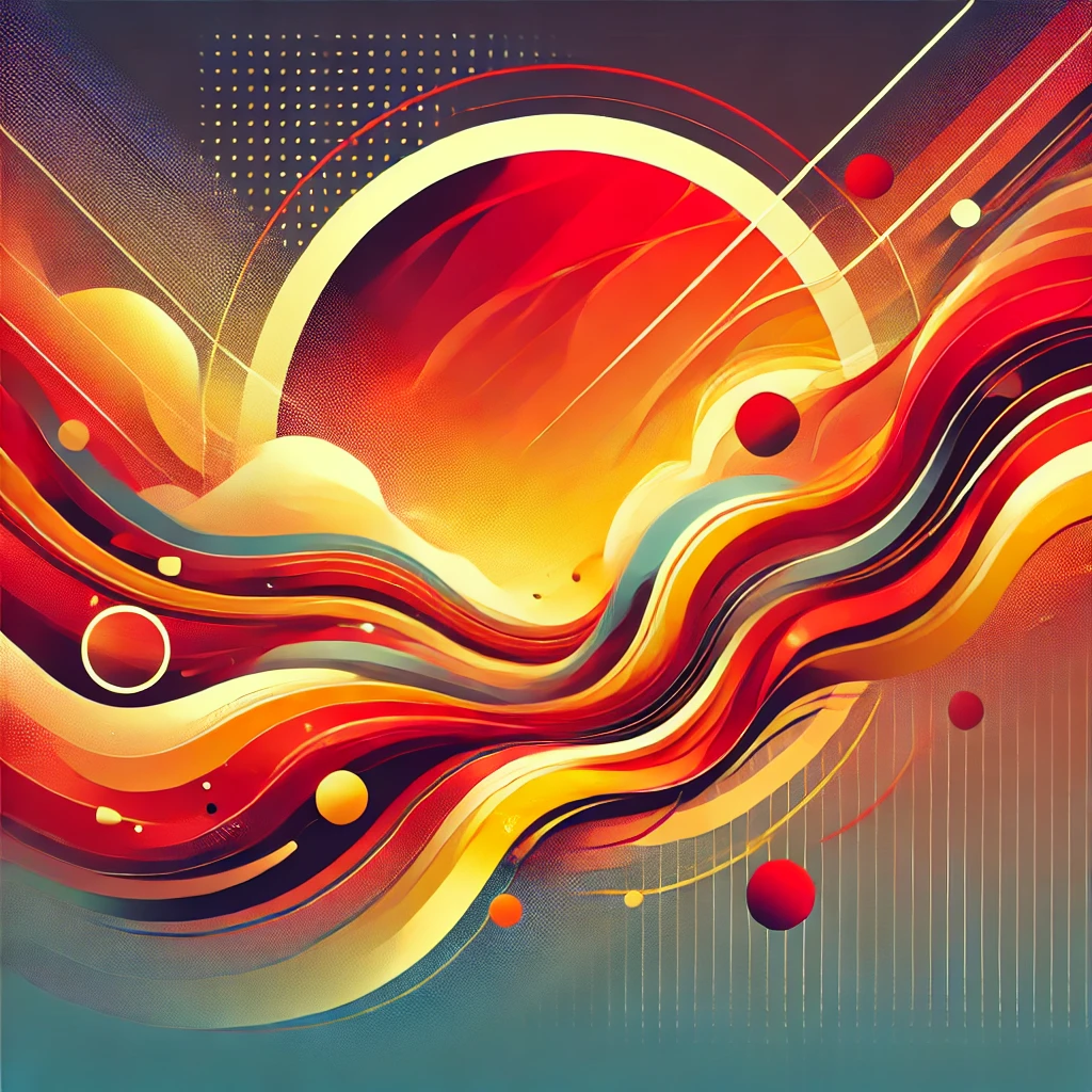
Warm colors (red, orange, yellow): enthusiasm, vitality, warmth, suitable for food, children’s products and designs with a strong sense of energy.
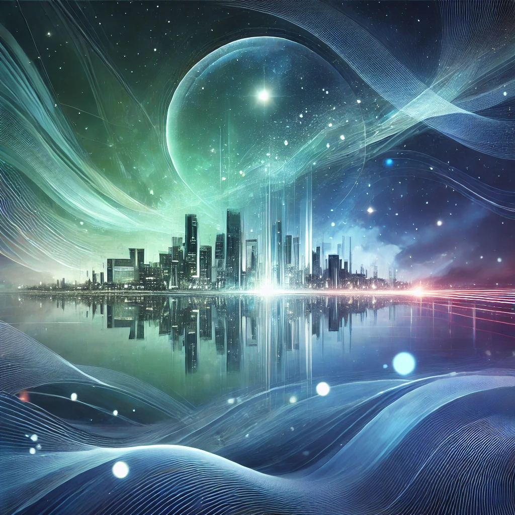
Cool colors (blue, green, purple): quiet, rational, and fresh. They are suitable for industries such as technology, medical care, and finance, and convey a sense of trust.
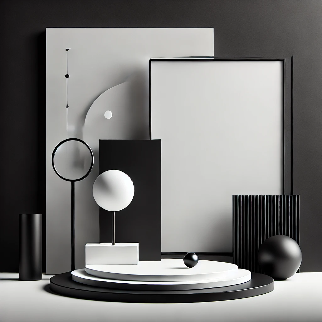
Neutral colors (black, white, gray): classic, simple, and advanced, suitable for fashionable and modern designs to enhance texture.
🔹 Monochrome matching: high-end and unified
By changing the depth of a color, designers create a layered yet visually unified effect.For example, different depths of blue can create a sense of technology and futurism, which is very suitable for brand logos or interface design.
🔹 Adjacent color matching: soft and natural
Adjacent colors are located in similar areas on the color wheel, such as blue + green, red + orange. This type of matching can enhance the coordination of the picture and is suitable for warm and natural design styles.

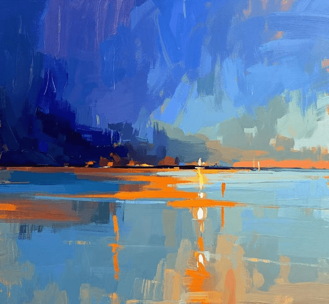
🔹 Contrasting color matching: strong visual impact
Contrasting colors are located on opposite sides of the color wheel, such as blue + orange, red + green. This type of matching can create visual tension and make the design more eye-catching. It is common in designs such as advertisements and posters that need to emphasize key points.
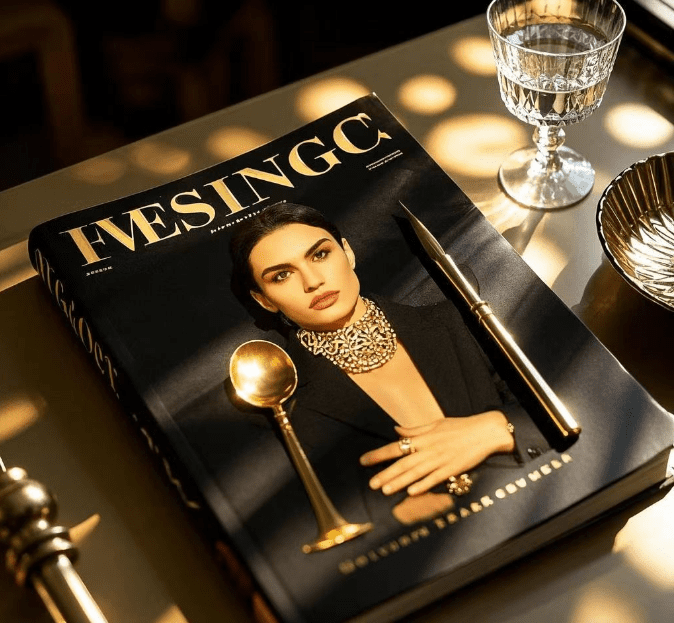
🔹 Black and white + embellishment color: minimalist style
Designers use black, white, and gray as basic colors, pairing them with bright colors like red, gold, or fluorescent hues to create a high-end visual effect. This approach is widely used in high-end brands and modern designs.
70-20-10 rule:
70% main color (background color or base color, determines the overall atmosphere)
20% auxiliary color (enhances the level and makes the color richer)
10% accent color (used to attract attention and create highlights)
In interface design, designers use white as the main color, blue as the auxiliary color, and orange as the accent color to enhance visual guidance.
Adjustment of brightness and saturation: high brightness colors bring a sense of lightness, and low brightness colors increase a sense of calmness. Lowering the saturation can make the picture softer, while high saturation is more impactful.
Matching the brand with the target user: The color should be in line with the brand personality and the preferences of the target audience. For example, technology brands often use blue, while luxury brands prefer black and gold.
Let color become your design language
Color is not only a visual element, but also a transmitter of emotion and information. Mastering the principles and techniques of color matching can make your design more attractive and recognizable. Reasonable use of color in website interfaces, graphic design, or packaging gives the work unique visual charm.
Let color empower design and make vision more contagious! 🎨✨
If you are interested in these contents or have design needs, please contact airsang design
17Feb
 06Apr
06Apr
 06Apr
06Apr
 20May
20May
 16Jun
16Jun
 13Jul
13Jul
 23Sep
23Sep
 27Sep
27Sep
 24Feb
24Feb
