Details from a web designer’s perspective
At Airsang Design, we embrace each client’s unique needs and goals, creating designs that align with their brand, audience, and market trends to achieve business success.
At Airsang Design, we blend clients’ visions with popular web design trends like responsive layouts, minimalist design, and interactive elements, creating solutions that balance creativity and practicality for optimal user experience and brand expression.

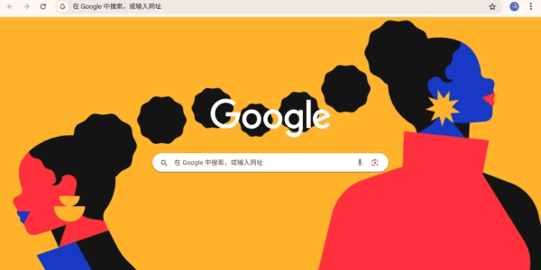
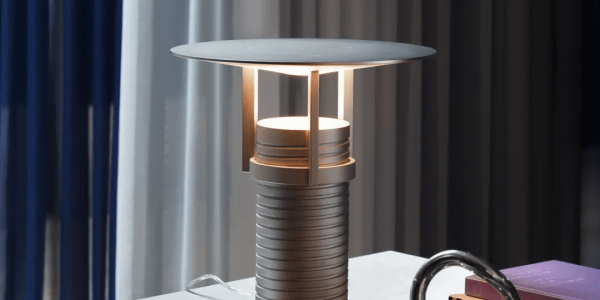
Shape
Website layouts often use various shapes, arranged either closely or with spacing. Here are common design shapes and their purposes:
- Circles: Often used for navigation, call-to-action buttons, icons, and logos.
- Rectangles and squares: Good for color or image blocks, buttons, navigation bars, and title labels to create a clean, organized look.
- Geometric shapes: Used for navigation, image overlays, and icon design to add structure to the layout.
- Organic shapes serve as visual focal points, especially when contrasted with geometric elements. They introduce depth, create visual hierarchy, and enhance overall design interest.
Minimalism
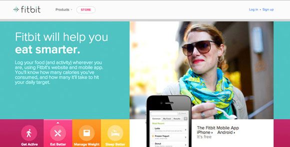
Minimalist design prioritizes core content. To create an effective minimalist website, focus on these key points for clear content display:
- Increase white space: Reduce visual noise by leaving white space to make the page fresher and cleaner.
- Use oversized typography to effectively occupy space, boost readability, and amplify the visual presence of your content.
- Optimize spacing: Add more spacing between titles, paragraphs, and paragraph lines to improve the hierarchy and readability of the layout.
- Introduce large-size elements: Use elements such as large buttons, icons, or screenshots on the page to enhance visual emphasis and guide users to focus on key information.
By applying these design strategies, minimalist style can more effectively communicate core content, enhance clarity, streamline user interaction, and ultimately elevate the overall user experience.
Flat Design
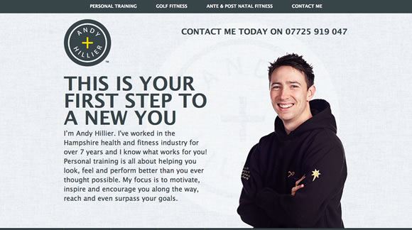
Flat design plays a key role in shaping the minimalist style. Its core features include the following elements:
- Remove three-dimensional realism: abandon visual effects such as gradients, bevels, and reliefs, and emphasize visual purity and simplicity.
- Flat colors: Use bright flat color blocks to create a clean and intuitive visual experience.
- Simple icons use minimalist lines and shapes for easy identification and effective information conveyance.
- Modular layout: Divide areas by color blocks to make the page layout more organized and visually layered.
- Monochrome fonts: Use simple monochrome fonts to highlight the clarity and readability of information.
These elements create a modern, efficient flat design with strong visual communication.
Typography
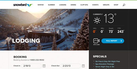
Good and creative use of typography is the key to improving web design. Here are some common typography techniques that can help better convey information and enhance user experience:
- Large text: suitable for titles, logos or focus areas of the page to attract user attention.
- Well-designed fonts: Use highly modified fonts to highlight important information, focus content or brand identity.
- Font combination: Flexibly use multiple font styles (such as bold, thin, condensed, etc.) in a sentence to ensure that the fonts are harmoniously matched and complement each other.
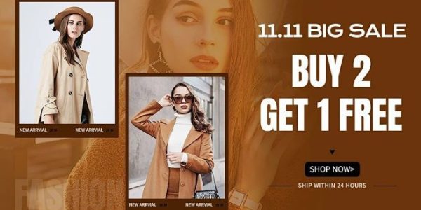
- Short call to action: Use one word or phrase as a description or guide, such as “Buy Now”, “Call Now” or “Free Demo” to trigger users to take immediate action.
Through clever typography, information can be conveyed more effectively, visual impact can be enhanced, and the overall design and readability of the web page can be improved.
Large images
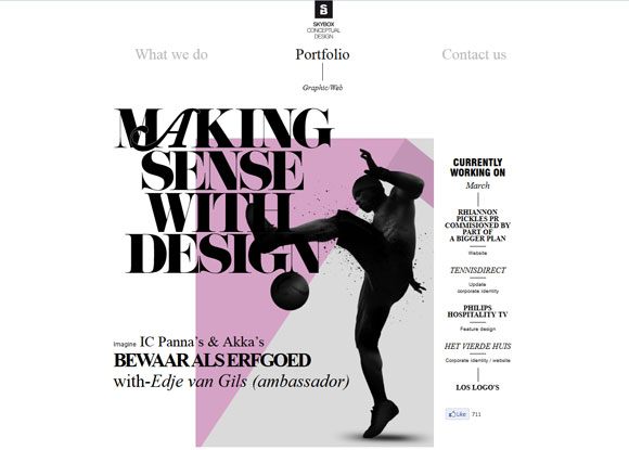
Using large images as part of your website design can create a sense of grandeur and visual impact for the overall look. With the popularity of retina display technology, it is now possible to use large high-definition images with smaller file sizes. You can refer to these 80 large background websites for inspiration and explore more creative possibilities. Several ways to use large images in your website include:
- Background image: Cover the entire screen background with an image to create a strong visual effect.
- Large banner: Occupies a quarter or half of the screen, suitable for eye-catching banner design.
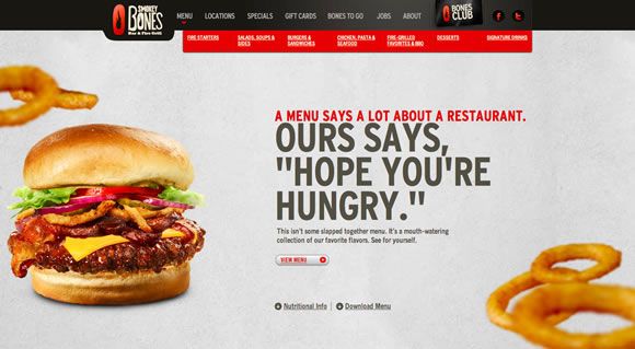
- Single element: Use a huge image of a person or product to stand out from the monochrome background and highlight the core content.
- Image combination: Crop multiple images into a combination of various shapes to create a rich sense of layering and creative effects.
By cleverly using these methods, you can make your website more visually attractive and design-oriented.
If you are interested in these contents or have website design needs, please contact airsang design!

