You need to know the same promotional design rules as designers
Careful design not only enhances the visual appeal of your company’s events, but also optimizes the user experience and improves the overall impact.

Effective design not only enhances the visual beauty of an event, but also optimizes the user experience.
The following design tips will help sellers create a successful event plan. Whether you have a basic knowledge of design or not, mastering these golden rules can create a simple, clear and meaningful design.
Bad design can ruin an excellent event. Using these tips on the website, mobile terminal or email, you can accurately convey the event information, let visitors focus on the key content, thereby increasing the interaction rate and achieving personalized event goals.
1.Simplify
Ashton’s design motto is: “Simplicity is the key to success.” In event design, every element should have its necessary existence, and the number of words, colors and shapes should be simplified to maintain visual clarity. For example, typography not only affects the readability of information, but also should be integrated with clear action instructions to enhance user experience.

2.Contrast is your best friend
Contrast is a crucial element in design, which directly affects color matching, readability, and overall visual experience.
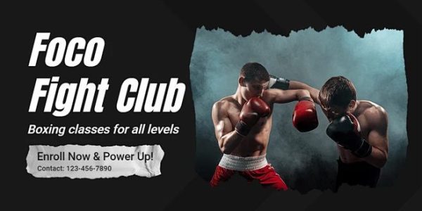
For example, in a dark-colored website, using bright and high-contrast colors as the active background can effectively attract visitors’ attention. Similarly, the choice of font color also needs to consider contrast: dark fonts are suitable for light backgrounds to enhance the readability of information.
As shown in the figure below, the main color is dark gray, which makes the personalized purple information at the top of the page more eye-catching:

3.Bold
One of the best ways to create a sense of visual unity is to use different variations of the same font. For example, you can use italics, bold, or boldface to differentiate levels.
Refer to the following page: event information uses regular fonts, important content is bolded, and personalized elements are used to highlight the key points.

4.Use “layers” to control the scene!
The most critical information should be the most prominent visual element and the first thing people notice.
Try adjusting colors, graphics, photos, or font size to optimize the information hierarchy and make the most important content stand out.
For example, in this fall-themed retail event, the core focus is “Fall Steals” and the “Shop Now” button is secondary. Make sure the key information is presented first to effectively attract attention.

5.Use vivid colors!
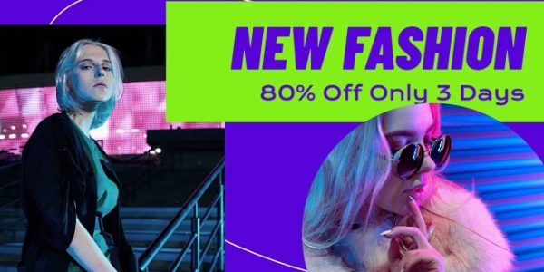
If you want to add a bold and unique visual impact to your campaign, you might want to use bright colors commonly used by your brand. Adjust the brightness of the background image through contrast and balance the font color to make the overall design sharper, clearer and more readable.
For example, choose bright and fashionable product images, match them with colorful splicing blocks, and use large white titles and text to create a strong visual effect.

Summarize:
Hopefully, these design tips will help you improve the effectiveness of your personalized campaigns! Before designing, it’s recommended that you develop a detailed campaign plan and work with your marketing or creative team to optimize the plan and ensure the best execution.
If you are interested in these contents or want to know how to optimize your independent website, please feel free to contact airsang design

