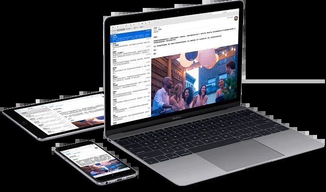
Working Hours

9:00 AM - 22:00 PM

What do you know about the pros and cons of website coloring?

Website coloring is an emerging and popular design trend that provides a unified and immersive browsing experience and strengthens the brand image by matching the browser address bar color with the website theme.

Website coloring is the process of adjusting the color of the browser interface (such as the address bar or toolbar) to match the website’s theme or brand. Through meta tags, designers can specify the color of these elements to enhance the visual experience. First introduced by Safari, it has now been adopted by many browsers.

Website coloring is more than just a design trend; it’s a strategic tool for improving visual appeal and user experience. Here are some reasons to implement website coloring:

  1. Enhance your brand: Coloring reinforces brand consistency beyond the website content.
  2. Improve your user experience: Reduce visual distractions and provide a smooth, enjoyable browsing experience.
  3. Modern feel: Add a stylish touch to your website and help it stand out.
  4. Increase engagement: Coordinated design draws users in and encourages more interaction.

Pros and Cons of Website Coloring
Advantages

  1. Visual Design Coordination: Synchronize browser UI elements and website colors, improve interface consistency, and make the design more professional.
  2. Improve content clarity: Reduce interference, make content more prominent, and enhance text readability.
  3. Strengthen brand image: Extend brand colors to browser interfaces to enhance brand awareness.
  4. Encourage user interaction: Smooth interface transitions attract users and increase interaction time.
  5. Help stand out: Unique tones attract attention, enhance website competitiveness, and create a unique user experience.

Disadvantages:
1) Accessibility challenges: Improper color contrast may affect the browsing experience of users with visual impairments, especially in the case of light backgrounds with light text or dark backgrounds with dark text.
2) Visual distraction: Mismatched tones may distract attention, making it difficult for users to focus on the content and affecting the visibility of important areas.
3) Color conflict: The wrong color choice may conflict with the overall color scheme of the website, especially for complex or vibrant websites, giving people a sense of disharmony.
4) User preference conflict: Inappropriate tones may conflict with users’ customized browser settings (such as dark mode), affecting the browsing experience.

In short, browsers may ignore coloring settings, resulting in inconsistent website design and user experience. Although most browsers support the theme color meta tag, user-defined color schemes may cause visual differences.

Conclusion: Website coloring can improve user experience, strengthen brand image, and create a modern design. By adjusting the browser color to match the website theme, you can provide a harmonious visual experience. If you want to improve your website design, try to implement website coloring by adding meta tags and colors. This is a small but significant improvement in user experience and branding.

If you are interested in these contents or want to know how to optimize your independent website, please feel free to contact airsang design

0 0 votes
Article Rating
Subscribe
Notify of
guest
0 Comments
Inline Feedbacks
View all comments

Enjoy this post? Join our newsletter

Please enable JavaScript in your browser to complete this form.

Don’t forget to share it

Your Best Solution

Related Articles

0
Would love your thoughts, please comment.x