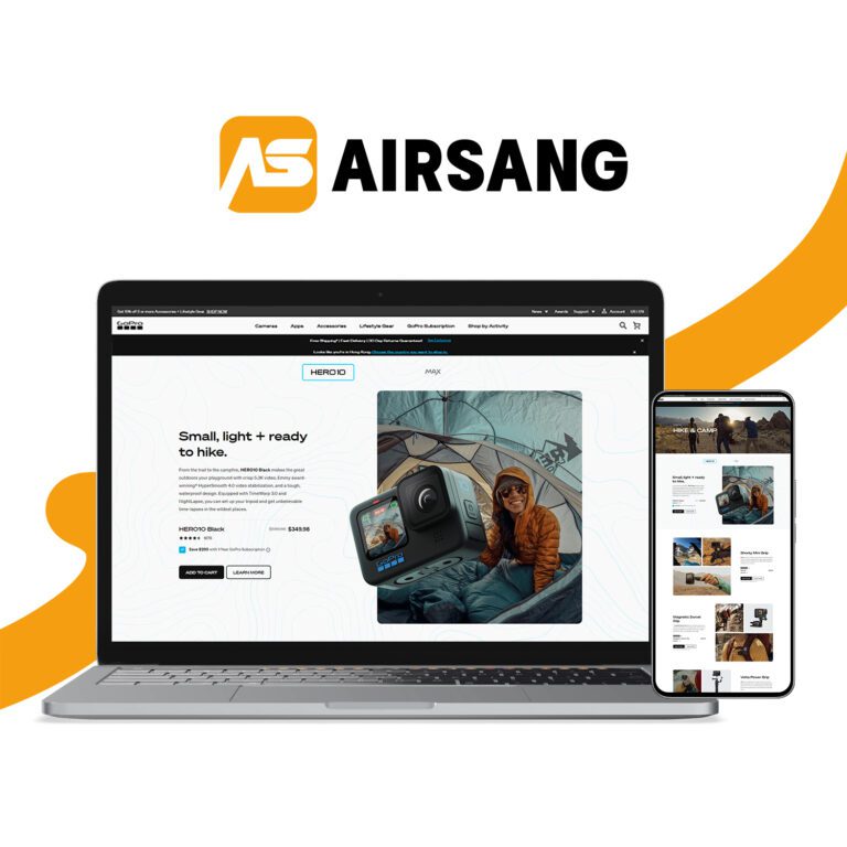
Top 5 Ecommerce Web Design Mistakes That Hurt Conversions
Stepping into eCommerce can be exciting—but at Airsang Design, we know it’s not just set-and-forget. Many underestimate the importance of smart design and end up with a site that underperforms. Based on industry insight and real-world experience, here are 5 common mistakes new online stores should avoid to build a high-converting eCommerce presence.

Prioritise Website Security from Day One
With cyber threats on the rise, website security is non-negotiable—especially for eCommerce. Customers share personal and payment details, so earning their trust is crucial. In fact, 15% abandon carts if they sense payment risks.
Security Tips:
- Install an SSL certificate to show “Secure” in the browser.
- Display trusted security badges at checkout.

Security badge examples from
Don’t Confuse Users with a Poor Category Structure
If you sell multiple products, a clear and logical category structure is essential. Your customers won’t know your catalog like you do—confusing layouts can drive them away.
For SEO and user experience, get your taxonomy right from the start.
Tips:
- Group products into intuitive, easy-to-follow categories
- Use SEO-friendly names for products and collections
- Plan a sitemap or wireframe to ensure structure clarity

Example of a sitemap
Missing Social Proof Signals?
When shoppers feel uncertain, they turn to others’ experiences—92% read at least one review before purchasing. If your product is great, let others say it. Genuine testimonials build trust and conversions—faking them does more harm than good.
Action Points:
- Collect real customer reviews and display them across your site
- Encourage feedback with small incentives
- Use trusted platforms like Google Reviews or Trustpilot
Is Your Contact Information Hard to Find?
Online shoppers value independence—but when they need support, real contact options matter. Hiding your info damages trust.
Action Points
- Add a clear Contact or Help page with email/phone
- Show contact details in the header or footer
Is Your Checkout Process Too Complicated?
Too many last-minute prompts during checkout—like upsells, newsletter signups, or rewards programs—can frustrate users and lead to abandoned carts. Unlike in-store, online shoppers can leave with a single click. With cart abandonment rates nearing 79%, streamlining the process is key to boosting conversions.
Checkout Optimisation Tips
Streamline to a 3–4 step process, enable guest checkout, and remove unnecessary fields—keep it fast, simple, and user-friendly.
Here are a few alternative ways to say “You’re Ready To Get Started With Retail” in a more polished or SEO-friendly tone:
- Time to Launch Your Retail Journey
- Kickstart Your Retail Success Today
- Ready to Dive Into Retail? Let’s Go
- Start Building Your Retail Brand Now
- Your Retail Venture Begins Here
Would you like it tailored for a specific platform or audience (e.g., Shopify, Amazon, DTC, beginners)?
Conclusion
At Airsang Design, we believe successful eCommerce begins with smart web design. By avoiding common pitfalls—like long checkout flows, poor navigation, and lack of trust signals—you’ll create a smoother path to conversion. Ready to build a retail website that’s secure, intuitive, and sales-focused? Let’s make it happen.


