In the world of adult luxury dolls, first impressions aren’t just important—they’re everything. Silicon Wives needed a homepage that wasn’t just visually seductive but also trustworthy, fast-loading, and conversion-optimized. This case study walks through the creative direction, structural decisions, and UX principles that guided the homepage redesign.
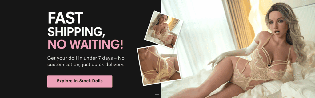
Design Rationale: The homepage opens with a full-width black screen banner featuring a call to action—”FAST SHIPPING, NO WAITING.” The model image used is hyperrealistic and emotionally appealing, placed diagonally in a collage layout to mimic “live snapshots.”
Why This Works:
The high-contrast black-and-pink color palette evokes urgency.
The “Explore In-Stock Dolls” button is styled in soft pink to balance sensuality with warmth.
The promise of delivery in under 7 days directly addresses the buyer’s common objection—long waits.
Social Proof & Customer Testimonials
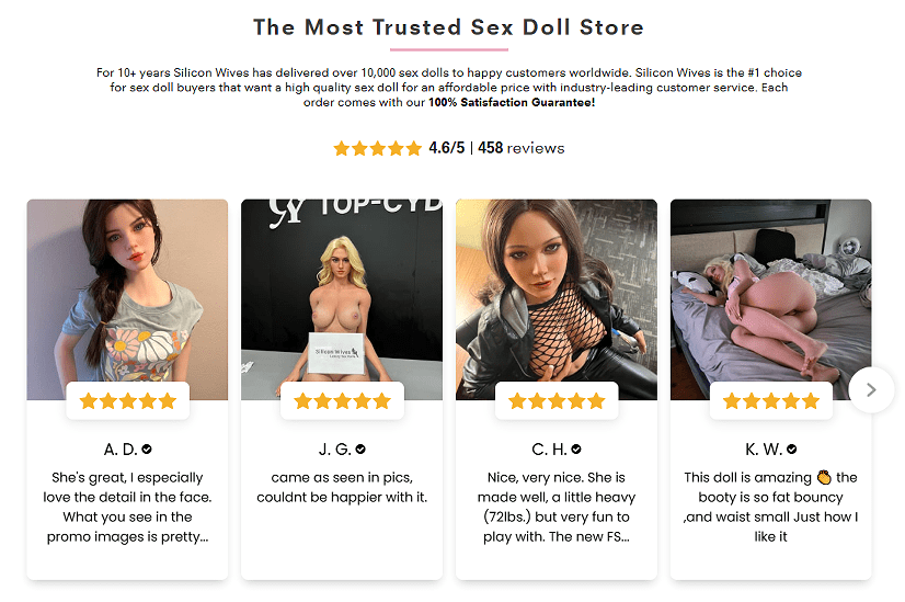
Design Rationale: Below the hero banner is a clean testimonial slider with real customer initials and reviews, each paired with doll photos taken by the buyers.
Why This Works:
Ratings (4.6/5) are immediately visible.
Authentic images from customers enhance trust.
Scrolling format encourages interaction without crowding space.
Brand Authority & Recognition
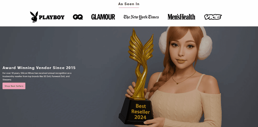
Design Rationale: The “As Seen In” section uses minimalist logos from iconic publications like Playboy, GQ, and The New York Times.
Why This Works:
Increases brand credibility instantly.
The award graphic (“Best Reseller 2024”) anchors long-term legitimacy.
Paired with a high-quality image of a doll holding a trophy, it humanizes the brand through character storytelling.
Best Sellers Section: Building Urgency
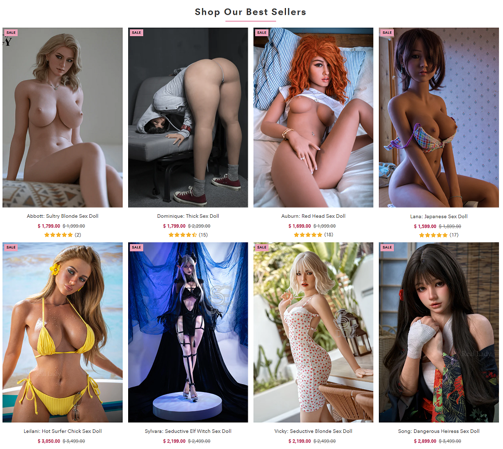
Design Rationale: Eight dolls are displayed in a grid, marked with SALE tags, crossed-out prices, and review counts.
Why This Works:
Consistent spacing makes it easy to scan.
Bright red pricing attracts the eye.
Star ratings and customer counts act as psychological proof of popularity.
The diversity of dolls appeals to a wider audience.
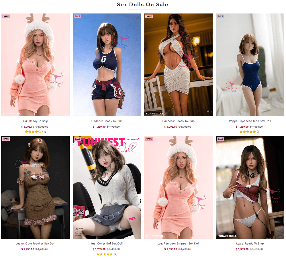
Sale Grid: Maximizing Click-Through Rate
Design Rationale: A second product block features dolls ready to ship—again marked with SALE badges, but this time paired with themed outfits like schoolgirls and reindeer costumes.
Why This Works:
Targets shoppers with specific fetishes or fantasies.
Emotional personalization increases time-on-page and cart additions.
Each thumbnail photo is carefully curated to mimic influencer-style photography for relatability.
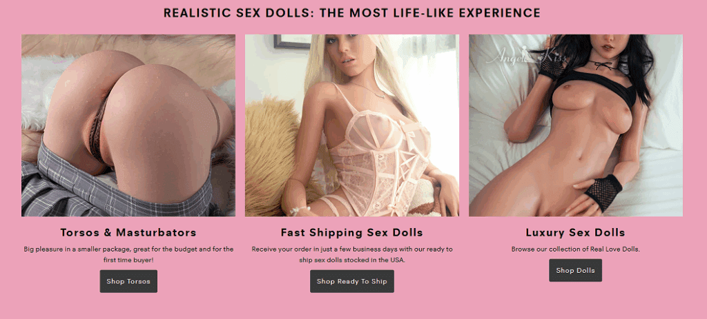
Experience-Based Category Block
Design Rationale: A pink section introduces three main experiential entry points: Torsos & Masturbators, Fast Shipping Dolls, and Luxury Dolls.
Why This Works:
The use of lifestyle-centric terms simplifies navigation.
Large clickable images increase mobile usability.
Each block is supported by visual hierarchy—image first, then short description, then CTA.
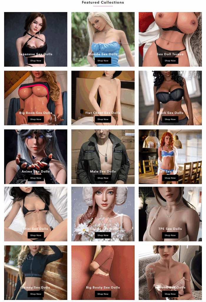
Curated Collections: Exploration by Fantasy
Design Rationale: A 4×4 grid presents collection categories like “Japanese Dolls,” “Big Boobs,” “Anime Dolls,” “TPE Dolls,” and more.
Why This Works:
Encourages deeper browsing through fantasy-based segmentation.
Visual uniformity in image style helps build an immersive experience.
Labels are simple and emotion-driven rather than technical.
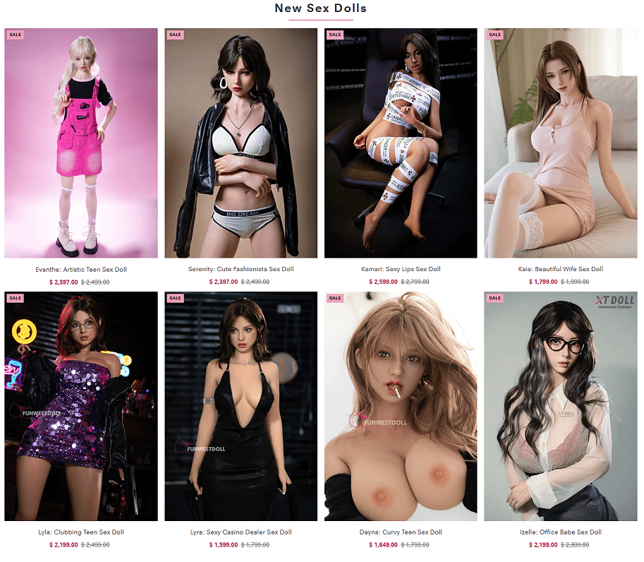
New Arrivals Section: Emotional Novelty
Design Rationale: A new dolls section spotlights fresh products in bold layouts, marked with SALE stickers and vivid names like “Dayna: Curvy Teen” or “Lyla: Clubbing Teen.”
Why This Works:
Names evoke character stories and allow users to imagine personalities.
Black and neon backdrops for nightlife dolls create dramatic contrast.
Great for returning visitors seeking novelty.
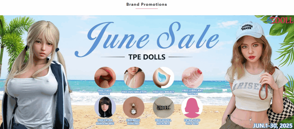
Seasonal Promo Banner: Anchored Value
Design Rationale: The June Sale banner features a beach scene with summer-themed dolls and icons offering bonuses (free wig, EVO skeleton, extra head).
Why This Works:
Bright blue and sand tones evoke summer vibes and boost mood.
Icons function as visual summaries of the offer—ideal for mobile.
Anchoring value through “extras” increases perceived savings.
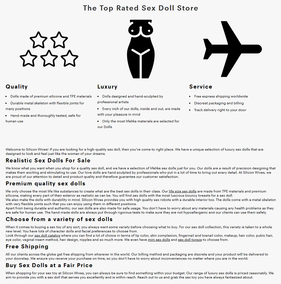
Trust Block: Materials, Shipping, and Service
Design Rationale: This section uses symbolic icons—stars, a female figure, and a plane—to communicate three promises: quality, luxury, and service.
Why This Works:
Simple black-and-white palette evokes clarity and professionalism.
Bullet points keep content digestible.
Gives peace of mind by highlighting health safety, handcrafted production, and discreet delivery.
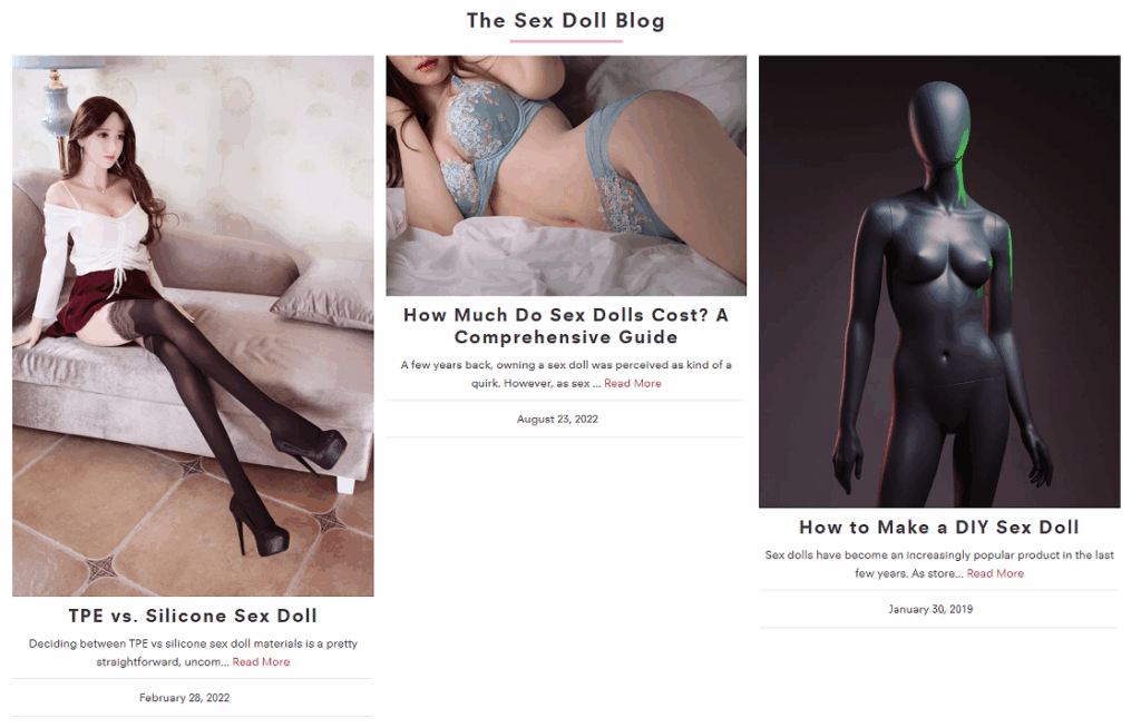
Blog: SEO and Buyer Education
Design Rationale: Three blog posts are listed with preview images and titles like “How to Make a DIY Sex Doll” and “TPE vs Silicone.”
Why This Works:
Drives organic traffic through long-tail keywords.
Helps inform new buyers and builds long-term trust.
Styled like a lifestyle blog to feel non-commercial.
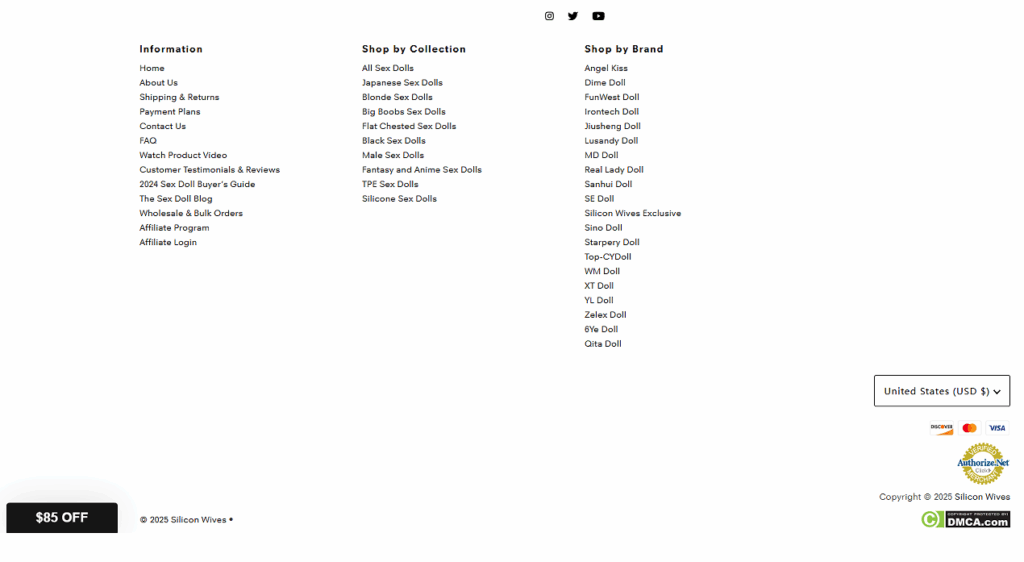
Footer: Utility Meets SEO
Design Rationale: The footer is divided into three navigational columns—Information, Shop by Collection, and Shop by Brand—along with social icons and currency selector.
Why This Works:
Provides quick access to support pages and affiliate options.
Enhances search indexing with structured internal links.
A sticky “$85 Off” popup boosts conversion without being intrusive.
Conclusion
The Silicon Wives homepage is more than a storefront—it’s a visual journey designed to build trust, arouse curiosity, and guide the user to purchase with ease. Every section is intentional, every element optimized for both desktop and mobile conversions. By leveraging psychological triggers, segmented discovery, and authentic imagery, this design not only performs—it seduces.
Web design is the “face” of an independent website, and at Airsang Design, we emphasize creating visually striking designs that align with the brand concept...
As the pet economy grows, the dog collar market faces intense competition. Consumers now prioritize quality, design, and added value over basic safety. With price...
Attracting users and keeping their attention is the key to high conversion rates and engagement. Mastering this is the key to creating memorable websites that...
In the increasingly fierce competition of cross-border e-commerce, having a high-quality independent website has become the key to brand success. As the world’s leading e-commerce...
Today we bring you the new logo design of the “Athena Art” dance training class! The design inspiration comes from Athena, the ancient Greek goddess...
YaZoo Pet Life Center LOGO design concept (2) Font designThe “YaZoo” brand name uses a modern and simple sans serif font, which has strong readability...
These 6 websites have different styles, there is always one that suits your aesthetic! Haus The Haus website is dominated by soft neutral colors such...


 30Apr
30Apr


")

