Shopify Builds FunnyFuzzy’s High-Converting Homepage
| Deliver Time | Category | Application Platform |
| 18days | Pet Supplies | Shopify |
| Designers Involved | Cost | Effect |
| Peter | $520 | Click-through rate📈260% |
Product Showcase:Why We Designed It This Way
When a brand revolves around the deep emotional bond between pets and their owners, the website must go beyond showing product features. It needs to evoke love, warmth, and trust—the same feelings a pet parent experiences when choosing something special for their furry companion.
This homepage was crafted to do just that:
- Trigger instant emotional resonance with cozy lifestyle visuals
- Guide pet lovers effortlessly from browsing to buying
- Build community through real user photos and reviews
- Showcase product versatility through rich, story-driven layouts
Below, we break down the strategic design thinking behind each core section of the FunnyFuzzy homepage.
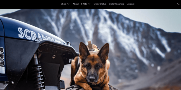
A Cozy World for Your Furry Friends

Why This Design
We intentionally avoided product grids at the start. Instead, we opted for a warm, lifestyle-driven visual to create instant emotional resonance. Visitors aren’t just “shopping”—they’re imagining how their home could feel more comforting with their pet in mind.
Conversion Strategy
A clear, concise CTA—“Shop Bestsellers”—bridges that emotion into action. It draws the eye without interrupting the flow, guiding the user into exploring with purpose.
From Stylish to Functional

Smart Layouts that Celebrate Utility and Aesthetics
The second fold introduces a flexible, scannable collection grid. Each product image features a clean backdrop, letting fabric texture, color, and utility shine through.
Why This Design
We chose uniform image sizing and balanced whitespace to establish visual consistency while highlighting the uniqueness of each item. Whether it’s a pet car seat or waterproof blanket, the layout treats all categories with equal visual weight.
Enhancing User Decision
Hover animations reveal brief USPs like “Machine-Washable,” “Scratch Resistant,” and “Vet Approved.” This encourages informed browsing without requiring click-through, reducing bounce and improving engagement time.
Scenario Blocks: Pet Life in Every Room

Turning Features into Feelings
This section splits the homepage into themed scenarios: Living Room, Car Travel, Bedroom, and Outdoor Play.
Why This Design
Rather than categorizing by product type, we grouped by pet parenting scenarios. This mirrors the thought process of users (“I need something for car rides” vs “I want a seatbelt for dogs”).
Strategic Copy + Visuals
Each block contains soft, emotionally driven copy like “Safe Rides for Tail-Wagging Adventures,” paired with lifestyle photos showing happy pets in use. This brings the utility to life and sets the emotional tone for each category.
User Engagement: Real Reviews, Real Trust

Let Pet Parents Speak
Next comes the user-generated content section—real photos from customers paired with short testimonials.
Why This Design
Today’s shoppers want proof over promises. Featuring real homes, real pets, and unscripted experiences builds authenticity, encourages conversion, and strengthens brand trust.
Design Execution
We used a collage layout to keep energy high and avoid formality. Each review block has a subtle background that aligns with the brand palette while letting photos stay in focus.
Seasonal Campaign: Limited-Time Warmth

Driving Urgency Through Emotion
A limited-time promo banner featuring fall colors and cozy dog bedding adds a final push toward checkout.
Why This Design
Seasonal themes stir immediate emotional response. The CTA “Wrap Them in Love” feels less transactional and more personally relevant—perfect for pet lovers who want to spoil their companions.
Layout Logic
We centered the text and overlaid it on a blurred background image to maintain readability without losing visual warmth. Countdown timers and “Low Stock” cues could be integrated here for added urgency.
Design Summary
From hero visuals to review-driven proof, this homepage was designed with one clear mission:
To create a warm, emotionally intelligent shopping experience that mirrors the deep bonds people share with their pets.
Every section was crafted not just to display products, but to tell a story of home, care, and joy. Navigation was simplified. Emotions were prioritized. Products were contextualized.
Website by AIRSANG DESIGN
We design high-converting Shopify and WordPress stores that turn brand stories into visual experiences.

