At Airsang Design, we believe the smart use of lines and colors is key in independent website design. Thoughtful combinations not only enhance visuals but also express the brand’s unique character. This article explores how to craft a site that’s both visually appealing and full of personality.
Kith
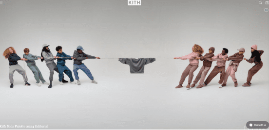
The design of the homepage is based on a vivid tug-of-war scene. The tug-of-war rope in the picture cleverly crosses the page, dividing the homepage into two independent spaces. This idea not only increases the visual sense of space, but also enhances the interactivity and attractiveness of the page through dynamic elements, focusing the user’s attention.
At the same time, the clear lines between the banners not only increase the layering of the page, but also effectively guide consumers’ sight and clearly tell them “this is the next section.” This design technique helps users browse the web more smoothly and improves the overall visual structure.
Kith’s line design plays an important role in visual guidance on the web page, helping users to browse the web content smoothly in a specific order. Through the concise and clear line layout, the confusion of the page content is avoided, the user experience is improved, and the overall interface is more intuitive and easy to navigate.
Unfortunate Portrait
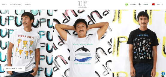
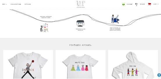
Unfortunate Portrait is a brand that has a deep love for line art. Both the product design and the brand logo use simple lines to create a minimalist yet expressive art style. This unique design language injects a unique visual charm into the brand, which is simple yet individual.
Unfortunate Portrait’s design cleverly uses lines of varying thickness, sometimes delicate and exquisite, sometimes bold and powerful. This line contrast creates a rich visual layering. The delicate lines highlight the exquisite details, while the bold lines add a sense of power and movement. The overall effect is unique and expressive.
The website’s illustration style is full of freedom, and the character design uses incompletely closed lines to create a “sketch” effect, which enhances the artistic atmosphere and creativity.
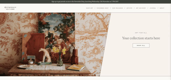
Partnership Editions
The Partnership Editions website features a simple, refined design with clean lines forming the layout’s foundation. Delicate lines divide titles, content, and modules, maintaining visual clarity without abrupt separations. This design creates a balanced, harmonious flow, enhancing both the page’s neatness and the user’s browsing experience.
The thin line separation design creates a subtle hierarchy and space, guiding users smoothly between sections for better visual flow and browsing comfort.
The simple line design gives the website a modern, artistic feel, highlighting the artwork and enhancing the brand’s high-end image.
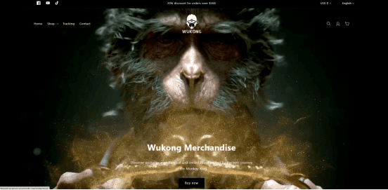
Tayest-Wukong
Tayest-Wukong’s banner design features a bold Heihua Wukong image, creating strong visual impact. It showcases the brand’s personality and unique interpretation of the classic character.
The website uses black and white as the main colors, with a white background and dark product displays. This contrast enhances visual impact, directs attention to the products, and improves the shopping experience.
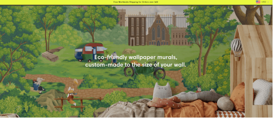
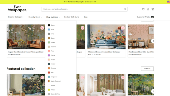
EverWallpaper
EverWallpaper‘s independent website uses bright colors, bright and impactful tones, instantly attracting consumers’ attention. The bold color scheme not only enhances the visual impact, but also creates a vibrant and creative artistic atmosphere, allowing consumers to feel the brand’s unique personality and vitality at first glance.
EverWallpaper’s navigation bar features a simple horizontal layout, with a “Shop By Color” section for easy product filtering, enhancing shopping efficiency.
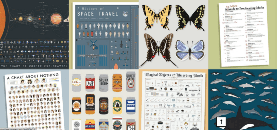
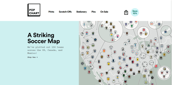
PopChart
PopChart’s website uses distinct color blocks for each section, enhancing visual hierarchy, clarity, and overall navigation ease.
By simulating the block design of keyboard keys, the three-dimensional sense of the web page is enhanced, making the page more vivid and layered. This design not only improves the visual effect, but also increases the interactivity of the web page, allowing users to feel more dynamic and immersive during browsing.
Conclusion
At Airsang Design, we believe lines and colors are vital to effective web design. In these independent website cases, they’re skillfully woven into product displays, enhancing visual impact and brand identity. Thoughtful use of these elements makes products more vivid and engaging, showcasing the true value of design!
One comment
Luca Orion
It might be helpful to share how the brand approached localization for overseas markets—would add extra value for readers.
In Shopify web design, true excellence lies in the details. At Airsang Design, we believe that every pixel, layout choice, and interaction should serve both...
Design is everywhere, from product appearance to architecture, advertising layouts to user experience, profoundly impacting our lives. So, what is design? Is it merely beautification,...
With the rise of online shopping, fashion brands face challenges in building trust without physical interaction. At Airsang Design, we emphasize the power of beautiful...
Google values not only the amount of content on a website but also its presentation and quality. At Airsang Design, we emphasize creating well-designed websites...
At Airsang Design, we believe in the top-down design approach, starting with the overall goal and progressively breaking it down into smaller components. This contrasts...
At Airsang Design, we emphasize the importance of proportion in website design. The right proportion of page elements—such as text, images, and buttons—creates balance and...
“Fantastic” designs break traditions, inspire creativity with unique forms, functions, or concepts, and brighten up daily life. At Airsang Design, we share 5 creative designs...


 09Apr
09Apr


One comment
Luca Orion
It might be helpful to share how the brand approached localization for overseas markets—would add extra value for readers.