


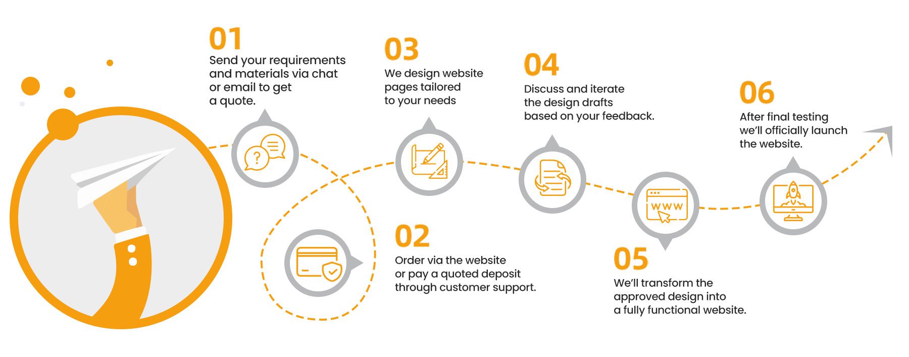
We specialize in turning your WordPress website into a high-performing growth engine. Using CRO strategies, performance testing, and data-driven insights, we optimize user journeys, increase conversions and inquiries, and strengthen customer loyalty. Every enhancement is crafted to maximize engagement and deliver measurable, long-term business results.
Recommended
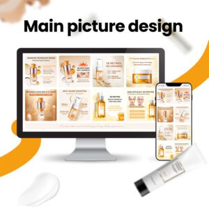
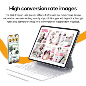
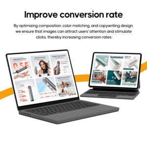
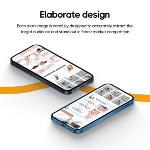
The main image design service focuses on creating visually impactful images with high click-through rate and conversion rate for e-commerce and independent websites. By optimizing the composition, scheme and copywriting, we ensure that the image can attract the user’s attention and ultimately drive clicks and increase conversion rate. Each main image is carefully crafted to accurately attract the target audience and promote in a fierce market. Our goal is to greatly improve the effect through visual design while increasing exposure and influence in the market.
4.85
Rated 4.85 out of 5 based on 88 customer ratings
Based on 88 reviews
Rated 5 out of 5 based on 76 customer ratings
76
Rated 4 out of 5 based on 11 customer ratings
11
Rated 3 out of 5 based on 1 customer rating
1
Rated 2 out of 5
0
Rated 1 out of 5
0
88 reviews for I will design high converting product listing images and optimize the main photo
Only logged in customers who have purchased this product may leave a review.


준호 –
이 제품은 소비자가 공감하기 쉬운 생활 장면과 자연스럽게 융합되어 있습니다. 전반적인 스타일은 통일되어 있으며 다른 그래픽 및 텍스트와 조화롭게 어우러져 있습니다. 디자인 스타일은 현대적이며 젊은 소비자들의 미적 취향에 부합합니다.
Savannah –
The unique design helps to enhance the brand’s competitiveness in the maternal and infant market. Starting from the needs of the baby, the design is thoughtful and the details are perfect.
Lawrence –
The interface is simple, the key points are highlighted, the user experience is friendly, the visual effects are dynamic, and it can attract sports enthusiasts. The product page has rich display and clear functional modules. The overall design highlights the sports atmosphere and fits the brand spirit. The innovative elements and high-quality content enhance the brand’s fashion sense and influence.
りな –
実際のユーザーエクスペリエンスを重視し、使用シナリオの表示を強化します。今回はぴったりのデザイナーを見つけました。とても良い。良いレビュー
ภัทราวดี –
การออกแบบหน้ารายละเอียดทั้งหมดสอดคล้องกับรสนิยมด้านสุนทรียศาสตร์ของสาธารณะและมีความรู้สึกถึงเทคโนโลยี ปรากฏว่ามืออาชีพก็ทำสิ่งที่เป็นมืออาชีพ
Samantha –
The colors are bright, full of spring and summer atmosphere, the fresh and lively style perfectly fits the brand image, the large product display directly highlights the product features, the page layout is simple and clear, the information is clear at a glance, the overall atmosphere is warm and friendly, suitable for young female groups, fashion and personalized elements are highlighted, it can attract target consumers, the designer’s aesthetics is online!!!
minni –
The use of bright colors can attract the attention of pet lovers and create a warm and lively atmosphere. The homepage layout is simple and easy to browse, with clear categories, allowing users to quickly find the products or information they want. The design highlights key information such as health and safety, which can enhance consumers’ trust in the brand, especially for pet owners’ purchasing decisions. The design not only takes into account the characteristics of pets, but also accurately captures the needs and preferences of pet owners, making the overall design more attractive and relevant.
Julian –
The font combination is very comfortable! The title is powerful, the text is smooth to read, and it doesn’t make your eyes tired after reading for a long time.
Queston –
The homepage design of this sports and outdoor product is concise and clear, with fresh and natural colors, conveying vitality and comfort. The main picture clearly shows the functions and usage scenarios of the product, enhancing the visual appeal. The design cleverly combines brand elements and product advantages to highlight the durability and convenience of the awning. The information layout is reasonable, users can see it at a glance, and the overall presentation is high quality and professional, which is very suitable for consumers who love outdoor sports.
Viktor –
Each element was carefully selected to maintain the high-end feel of the design. The pet’s posture and expression are very natural, conveying the comfort and usability of the product. The designer pointed out that this simple and direct design approach is very consistent with modern consumers’ expectations for a clear and professional brand image.
William –
The design highlights the brand’s sporty attributes. Through dynamic images and modern design style, it clearly conveys the brand’s youthful and energetic image, highlighting the vitality and fashion sense of sports shoes.
Sophia –
Professional things are left to professionals. The designers and customer service are very patient in completing the requirements. The whole design is very beautiful and satisfactory.
Olivia –
This is a perfect interpretation of what design is. I love it, love it, love it. I give a thumbs up to this Ai Shang designer….
Stella –
Strong visual impact, unique creativity, design style in line with brand personality, full of artistic sense, bold use of colors, full of personality and vitality, exquisite tattoo patterns, strong details, in line with the aesthetic needs of young groups, full of fashion sense, high-quality pictures show tattoo details, enhance appeal, fashionable but not exaggerated, modern and artistic
Charlotte –
The designer listened to my needs carefully. I am very satisfied with the overall design. The customer service is also very enthusiastic. Good comments.
Emily –
The use of bright and vibrant colors is in line with the positioning of children’s products, giving people a warm and pleasant feeling. Showing photos of children using skates in different environments allows parents to imagine the situations in which their children use them. The designer really puts a lot of effort into highlighting the selling points of the shoes through a combination of pictures and texts. Good reviews
Audrey –
Empfehlen, empfehlen, empfehlen, ich sage es dreimal. Sehr gutes Designteam, keine Kommunikationsbarrieren, sehr professionell,
Celeste –
The details are clearly displayed, the background blur is well processed, and customers say it is high-end
Paige –
The design is simple and interesting, attracting the baby’s attention, with warm colors, suitable for the maternal and infant market, and the shape is creative and unique, stimulating the baby’s imagination and desire to explore
Evermore –
The banner design of this hardware accessory is concise and clear, highlighting the practicality and high quality of the product. The steady color tone, combined with the exquisite product display, enhances the visual impact. The design elements are arranged in an orderly manner, and the information is clearly transmitted, which perfectly presents the professional image of the brand and enhances the user’s trust.
Taylor –
The design uses a combination of dark tones and metallic luster, giving people a high-end and profound feeling, which perfectly matches the brand’s jewelry theme. The combination of jewelry display and brand story or cultural background allows users to not only see the products, but also better understand the story behind the brand, enhancing emotional connection. The use of colors is rich in layers, and the contrast between dark colors and bright gold and silver highlights the texture of the jewelry, while maintaining a mysterious and elegant atmosphere.
gophia –
Combining the baby with the cradle bed fully considers the dual needs of parents and babies, which is very innovative. The design takes into account easy cleaning and maintenance to ensure the hygiene and comfort of the baby when using it.
Isabella –
The design meets the needs of pet owners and can attract potential buyers, especially pet lovers, through the cute display of pets. Through the actual usage scenario display, it helps consumers build up the real feeling of pets using the product in their minds. The designer has put in a lot of effort.
Gerald –
The design is concise and clear, conveying the product functions clearly. The overall design is simple but powerful, highlighting the high-tech feel of the product. The designer is in line with my aesthetic taste. The design is modern and fits the positioning of the vehicle-mounted product.
Lily –
Le service client est très enthousiaste et l’esthétique du design est en ligne
Taylor –
The banner image is mainly green, and the overall design is warm and natural, giving people a fresh and comfortable feeling. Green represents life and growth, which is very suitable for baby-related products and conveys a safe and healthy brand image. The elements in the picture are simple and childlike, which can quickly attract the attention of parents and create a pleasant and relaxing atmosphere. The overall visual effect is fresh and soft, which helps to highlight the affinity and high quality of baby toys. Thumbs up for the designer
Tae-hyun –
Pencocokan warna dan desain tata letak gambar utama sangat menarik dan dapat segera menarik perhatian pelanggan sasaran, terutama pada platform e-commerce yang sibuk, yang menonjolkan fitur dan keunggulan produk. Gaya gambar sangat konsisten dengan nada merek, dan desainernya penuh perhatian
Louis –
The overall design of the homepage of jewelry, earrings, necklaces, retro style, western cowboy clothes is very unique and individual. The combination of western cowboy style and retro elements is very unique. It has both classic nostalgia and can attract contemporary young consumers. The homepage design is well-structured, highlighting the exquisite details of the jewelry and the unique texture of the clothing, making it clear at a glance. The design clearly conveys the personality of the brand and is suitable for consumers who like retro and independent styles.
Cole –
This main image design for auto repair is concise, colorful and professional, accurately conveying the brand’s reliability and technical strength. The product details are clearly displayed, highlighting the high quality and functionality of auto repair tools, which can effectively attract consumers’ attention. The overall layout is neat and the focus is clear, which enhances the user’s desire to buy. It is an efficient and market-attractive main image design.
จิรายุ –
ออกแบบได้ดีมากตามความต้องการของลูกค้าพอใจมาก
Ryan –
The hardware accessories homepage is simple and elegant, with a steady color tone, highlighting the professionalism and quality of the products. The homepage has a reasonable layout and clear classification, allowing users to quickly find the products they need. High-quality product images and detailed descriptions enhance the sense of trust, simple navigation improves user experience, and the overall design effectively conveys the brand’s professional image.
Mia –
Although the design process is slow, the quality is visible. The virtual design of the game homepage is full of creativity and dynamism, with bright colors and rich layers, which successfully attracts players’ attention. The layout is simple and intuitive, and the navigation is clear, allowing players to quickly find what they need. The animation effect is smooth and natural, which enhances the sense of immersion. The overall design not only reflects the core elements of the game, but also improves the user experience and is very attractive.
Zoe –
The homepage is simple and elegant, with harmonious color matching, highlighting the product functions and practicality. The large pictures are clearly displayed and the details are exquisitely processed, so users can easily find the information they need. The layout is reasonable, the classification is clear, and the navigation is smooth, which enhances the user experience. The overall design highlights the brand’s professionalism and quality, which meets the needs of target customers.
中国梦 –
設計師採用了豐富的色彩搭配,營造出歡樂、慶祝的氛圍,完美契合氣球派對的主題。
Keith –
The lighting and speed elements in the design convey a sense of dynamism and adventure, which is in line with the characteristics of off-road vehicles. The bold design and bright colors can quickly attract the attention of off-road enthusiasts. The combination of lighting effects and off-road scenes clearly conveys the purpose and function of the product.
admin –
The design of the health care products is simple and professional, with fresh colors, conveying a healthy and natural brand image. The packaging material is high-end, and the combination of pictures and text is clear and concise, highlighting the core advantages of the product. The overall design meets consumers’ demand for quality and trust, and enhances the brand’s credibility and appeal.
Victoria –
The homepage design cleverly combines mysterious metaphysical elements with the luxurious texture of jewelry, creating a thick mysterious atmosphere through colors and patterns to attract attention. The homepage design pays attention to details, and the gloss and texture of jewelry are displayed through fine design, creating a high-end and exquisite brand image. It gives people a high-end and profound feeling, which perfectly matches the brand’s jewelry theme.
Amalia –
The designer cleverly incorporated tattoo elements to showcase the brand’s personality and artistic sense. The homepage is full of creativity, but the overall layout remains concise and clear, allowing users to easily navigate and find content of interest. The design conveys a strong emotional appeal through unique patterns and atmosphere, which can resonate with the target audience, especially young people who love tattoos.