


Shopify web design sharing – perfectionism in details!
Death wish coffee The website uses “black” as the main background, which not only complements the brand logo, but also creates a “mysterious” and “profound”...
Brand style and page logic
Thematic visual planning
The design should be based on public demand and focus on “intuitive” and “clear” style presentation. Theme planning, such as Christmas or New Year marketing, should be designed according to the festive atmosphere to ensure that the style is consistent with the characteristics of the festival. For example, the New Year theme can create a strong festive atmosphere through elements such as wishful knots or ribbons.
Three ways to create atmosphere:

inChinese style

Unique
Rough marketing
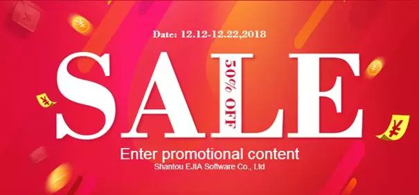
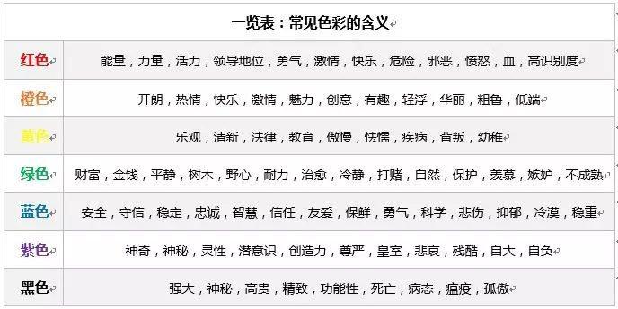
Color tone atmosphere design marketing
The choice of color tone mainly considers brand tone, activity goals, popular colors and seasonal characteristics. In terms of brand tone, when people mention [Tiffany&Co.], they naturally think of its iconic Tiffany blue; when people mention [McDonald’s], they think of the classic yellow and red color combination. Therefore, thinking about the brand’s most commonly used or most representative main color can effectively convey the brand image.
Purpose of the event:
If the purpose is to spread brand information, the marketing atmosphere can be weakened and the corporate characteristics can be highlighted; if the purpose is to make a profit, the promotion atmosphere should be emphasized, especially in recent years, e-commerce marketing has used more colors and materials such as “red, orange, blue, and purple”.
Popular colors and seasonal styles:
Spring and summer are usually associated with green, while autumn and winter are associated with earth tones. The overall color tone should refer to the popular trends of the year or season. Whether it is product color matching or store decoration, avoid sticking to outdated colors. However, if your market is the Middle East, heavy colors and “rich style” color matching will be more popular, especially in product design.
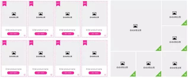
Layout by category
The platform product display needs to focus on logic and hierarchy, especially during the promotion period, when visitors have limited time and need to be retained through attraction. It is recommended to classify promotion products in detail, such as setting up special areas by category, style, price, etc., such as similar products, matching products, special price areas, etc. Avoid dividing only by style or simple price, and use dimensions such as “category”, “price range”, “discount” and “package matching” to display more professionally, and reflect them in the associated marketing module on the homepage or product details page.
Regarding the layout and typesetting, a brief summary is as follows:
Stimulating elements encourage buyers to stay
Digital pricing
Clear discount information can attract customers, for example, “30% off the entire store” is more attractive than “30% off the entire store, up to XXX yuan”, and the latter is more likely to stimulate purchase desire.
Creative design
The design does not have to be complicated, the key is to attract visitors’ attention through clever page layout or copywriting. Make sure to set guiding content and clear jump entrances, such as product, description, event or category entrances, to improve user experience.
Differences between PC and mobile
Do you think that PC and mobile are just different in the way they display pages, and that there is no need to differentiate the design and content presentation? If so, you need to adjust your thinking quickly!
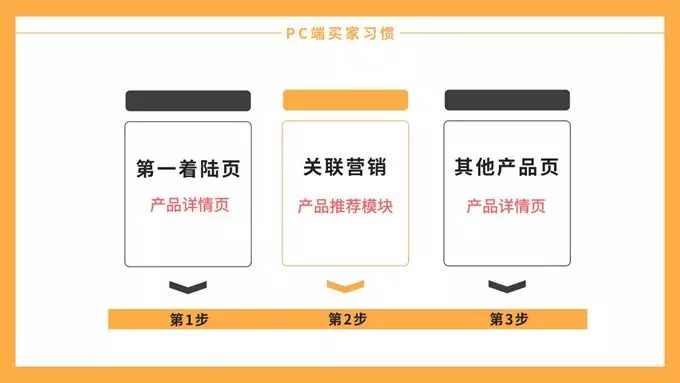
PC
On the PC side, buyers usually find products through search, browse product information after entering the detail page, and further browse recommended products through embedded affiliate marketing. The process is: search for products → click on the detail page → view affiliate marketing → select recommended products → jump to browse other detail pages
【Mobile】
On mobile devices, buyers’ search and browsing habits have changed. Usually, after entering the product details page, they will first visit the store homepage, and then browse other products or secondary pages through the homepage. The process is: search for products → click on the details page → enter the store homepage → browse other products/secondary pages.
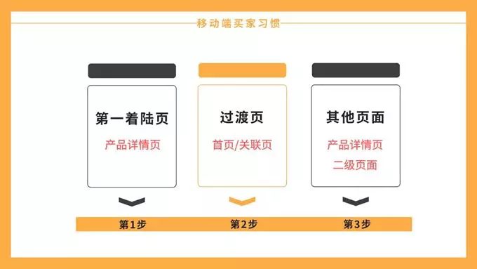
In summary, the differences in browsing logic between PC and mobile terminals lead to the following conclusions:
① PC terminal: Strengthen the [same store product recommendation] function to increase the diversion effect.
② Mobile terminal: focus on the

By cleverly setting up the main promotion, hot-selling and new product areas, and giving priority to display according to transaction data or buyer preferences, you can increase jumps and diversion entrances, maximize the extension of buyer browsing time, and improve order conversion rate.
If you are interested in these contents or want to know how to optimize your independent website, please feel free to contact airsang design
 09Apr
09Apr
 30Apr
30Apr
 11Aug
11Aug
 24Dec
24Dec
 10Feb
10Feb
 06Apr
06Apr
