We’re thrilled to unveil our latest visual creation — the main product image design for the LEO 26″ Adult Electric Bike, crafted by the design team at Airsang.com.
This project goes far beyond just “making something look good.” It’s about capturing the essence of urban mobility and turning product visuals into a powerful sales tool. Let’s take you behind the scenes and explore the core ideas and techniques that brought this design to life.
Deliver Time
Industry
Application Platform
15 days
Electric bikes
shopify、Amazon
Designers Involved
Cost
Effect
Petter、Yoshi
$ 620
Organic traffic 📈163%
🚲 A Bike Built for the Urban Jungle
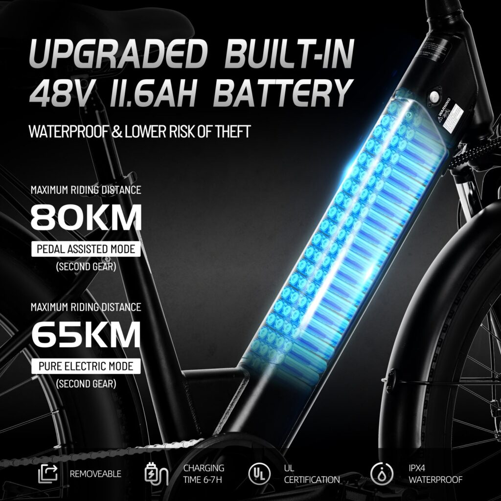
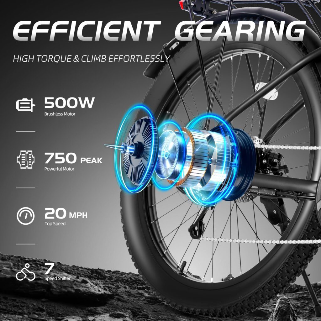
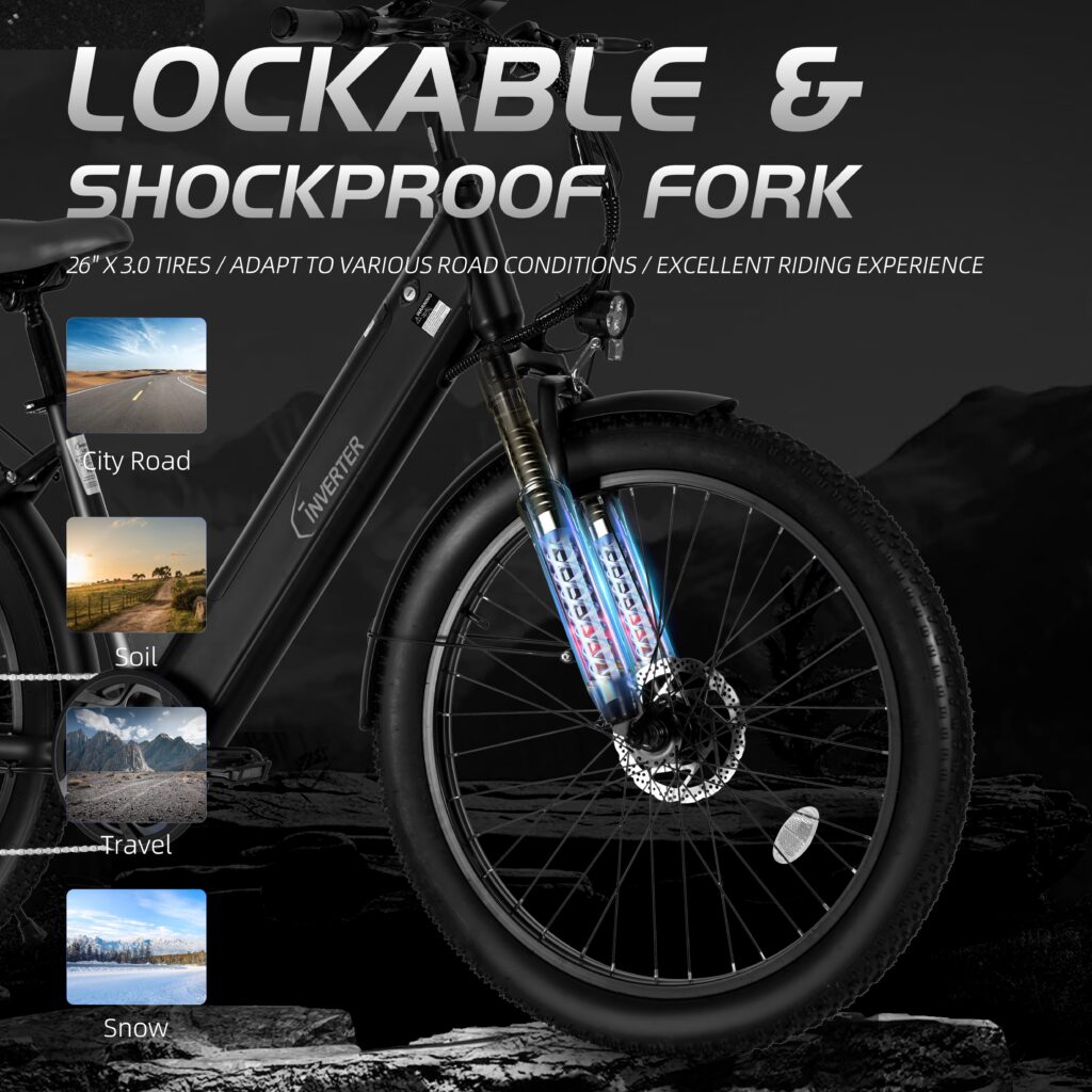
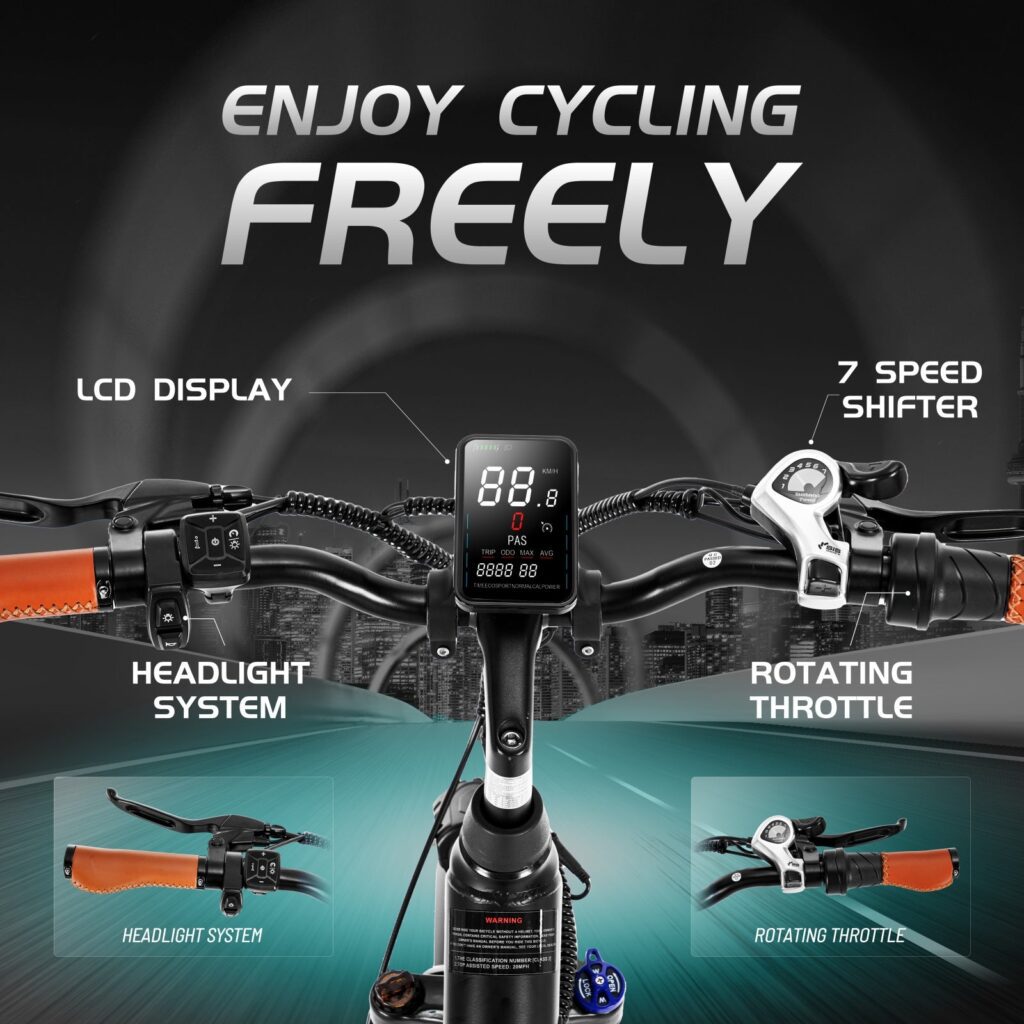
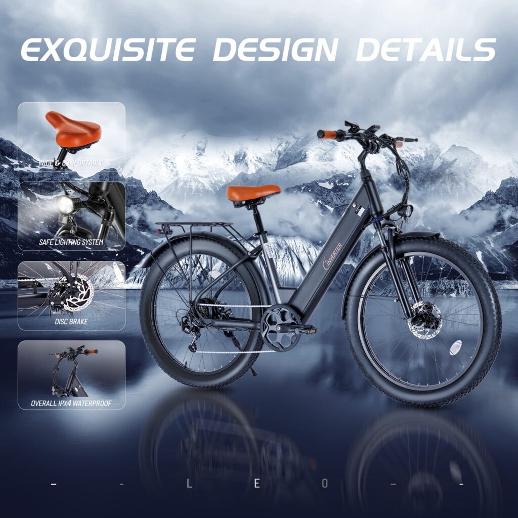
The LEO 26″ Electric Bike isn’t just another e-bike it’s a commuter’s best friend. Built with 3.0″ wide fat tires, a pedal assist system, and a frame that balances toughness with urban elegance, this bike is perfect for navigating city streets with style and ease.
Whether you’re heading to work, exploring backstreets, or avoiding traffic, the LEO 26 is designed to keep up — comfortably, efficiently, and effortlessly.
And a product this good deserves visuals that sell it in 3 seconds.
🎨 Our Main Image Design Strategy
A main image in eCommerce isn’t just decoration — it’s your first impression, your sales pitch, and your conversion driver, all in one. That’s why we focused on the following 3 key areas:
✅ 1. Color Scheme: Mood + Contrast = Impact
We chose a deep, dark color palette with blue undertones to reflect a modern, tech-inspired aesthetic. This instantly communicates a sense of reliability, power, and forward-thinking design — all values that align with the product itself.
Pairing this with a high-contrast background helps the bike silhouette pop, especially on crowded product listing pages like Amazon or search-heavy environments. The subtle lighting and gradient give the product a premium, high-definition feel that grabs attention without shouting.
✅ 2. Composition & Layout: Function Meets Emotion The image layout is designed with both logic and emotion in mind.
We clearly showcase electric assist system components and key riding features, ensuring that even someone seeing the image for the first time can grasp the product’s selling points.
The angled perspective adds a dynamic sense of motion, enhancing the idea of speed, freedom, and smooth commuting.
Visual elements are placed in a flow that guides the viewer’s eye — from the wheels to the battery, and finally to the bold brand name — reinforcing awareness and memory.
The composition also aligns with DTC website layouts and Amazon image requirements, so it’s versatile across platforms — consistency without compromise.
✅ 3. Typography & Icons: Clarity That Converts
We applied gradient silver-gray fonts that echo the metallic materials of the bike itself — adding depth, texture, and modernity. These fonts create a premium look and feel, which subtly suggests that the bike is not just functional, but high-end.
The main selling points are paired with minimal icons, designed to communicate features such as “Pedal Assist,” “Fat Tires,” or “Long Battery Life” at a glance. This is especially critical for mobile shoppers, who scan rather than read — a well-chosen icon and 3 words can do more than 2 paragraphs.
All of this helps boost click-through rate in competitive marketplaces. Our goal: Make users stop scrolling and start imagining themselves on that bike.
🧠 Design with Intent: Not Just “Good-Looking”
At Airsang, we believe product visuals should do more than look nice — they should drive understanding, desire, and action. Our design philosophy is rooted in psychology and performance marketing, blending aesthetics with conversion data.
This isn’t just a static image. It’s:
A conversion-optimized thumbnail for marketplaces
A hero visual for your product page
A brand asset that strengthens identity
Our work on the LEO 26 project is a great example of how thoughtful visuals can turn a great product into a high-performing eCommerce experience.
👇 Ready to Power Up Your Brand’s Visuals?
Whether you’re launching your first product or optimizing your flagship SKU, our team is here to help you design product images that actually sell.
Amazon Ready
Shopify & DTC Site Compatible
Conversion-Driven, Brand-Centered
✨ Brand visuals aren’t just about looking good — they’re about making users want to click in 3 seconds.
Want your product to stand out with scroll-stopping visuals? We specialize in eCommerce product page design and website building for cross-border brands.
Web design is the “face” of an independent website, and at Airsang Design, we emphasize creating visually striking designs that align with the brand concept...
As the pet economy grows, the dog collar market faces intense competition. Consumers now prioritize quality, design, and added value over basic safety. With price...
Attracting users and keeping their attention is the key to high conversion rates and engagement. Mastering this is the key to creating memorable websites that...
In the increasingly fierce competition of cross-border e-commerce, having a high-quality independent website has become the key to brand success. As the world’s leading e-commerce...
Today we bring you the new logo design of the “Athena Art” dance training class! The design inspiration comes from Athena, the ancient Greek goddess...
YaZoo Pet Life Center LOGO design concept (2) Font designThe “YaZoo” brand name uses a modern and simple sans serif font, which has strong readability...
These 6 websites have different styles, there is always one that suits your aesthetic! Haus The Haus website is dominated by soft neutral colors such...


 30Apr
30Apr


")


One comment
Gabriella3810
Very good