How to design an independent website to retain customers?
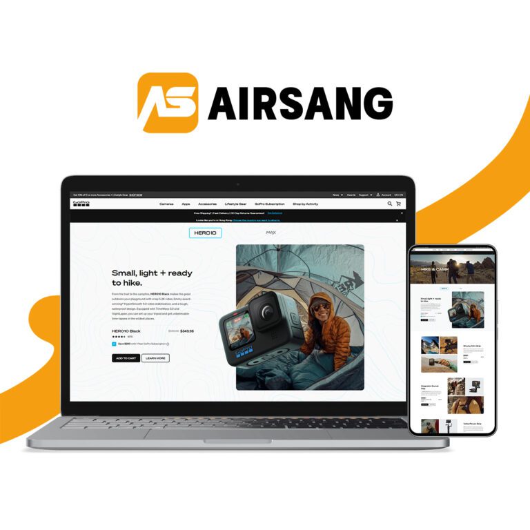
Today, based on the aesthetic preferences of international users, I’ll be sharing a selection of independent websites that customers genuinely love. At Airsang Design, we focus on blending global design trends with user experience to create stores that not only look stunning but also convert. Store visuals will be attached for your reference and inspiration.
1.Web page color matching
When building an independent website, be sure to abandon Chinese thinking and follow the aesthetic habits of the overseas market!
Before building a website, you may wish to study some foreign independent websites. (shopify、wordpress)You will find that they generally adopt a simple and clear architecture, tend to be minimalist, and have clean and unified colors, avoiding overly fancy or complex designs. This style not only enhances the professionalism of the brand, but also brings better user experience and improves conversion rate.


The main colors are usually calm colors such as dark gray, dark blue, dark red or black, which not only show the grandeur and stability, but also incorporate a fashionable and avant-garde sense of design, creating a professional and stylish visual experience.


Occasionally, bright auxiliary colors are cleverly used to enhance the visual impact with sharp color contrast, which not only attracts visitors’ attention, but also deepens brand memory and creates a unique visual experience.


Of course, the characteristics of some industries determine that they will choose bright colors such as bright yellow and dark green as the main colors. These colors can quickly attract attention and convey vitality, creativity or specific brand personality.

Web Color Matching Tips for International Sites
Simplify, unify, and enhance brand identity
Limit the Color Palette
Keep the number of colors within three to maintain visual clarity and harmony. A simple palette helps users focus and creates a cleaner browsing experience.
Prioritize Brand Colors
Use the brand’s primary color as the visual anchor. This strengthens recognition and ensures consistency across all digital touchpoints.
Add Style Colors Thoughtfully
Support the main color with 1–2 style or accent tones that reflect the site’s personality and emotional tone. This approach builds atmosphere and enhances user engagement.
Boost Brand Recognition and Conversion
With smart color combinations, brands not only achieve visual unity but also leave a stronger impression, increasing user trust and driving conversions.
2.Page layout
Website Layout in China
In China, website layout focuses on customer needs and industry characteristics, with a heavy emphasis on information.
Content-Rich Homepages
Chinese websites often feature homepages filled with diverse content, such as product displays, services, and brand advantages, aimed at capturing user attention quickly.
Formal and Modular Design
The design style is formal, with a clearly modular structure that enhances user experience by dividing sections for easy navigation.
Increased User Engagement and Conversions
This layout helps users quickly find relevant information, conveying professionalism and credibility. The clear structure and content richness improve conversion rates.

Design Preferences on European and American Websites
Focus on Brand Personality and Visual Impact
Foreign websites, especially in Europe and the U.S., emphasize strong visuals and brand expression. Designs strive to convey the brand’s unique value through clean, impactful layouts.
Simplified Structure for Better User Experience
Compared to other regions, these sites typically feature simplified navigation and intuitive UX, helping visitors quickly find what they need.
Banner Design Highlights
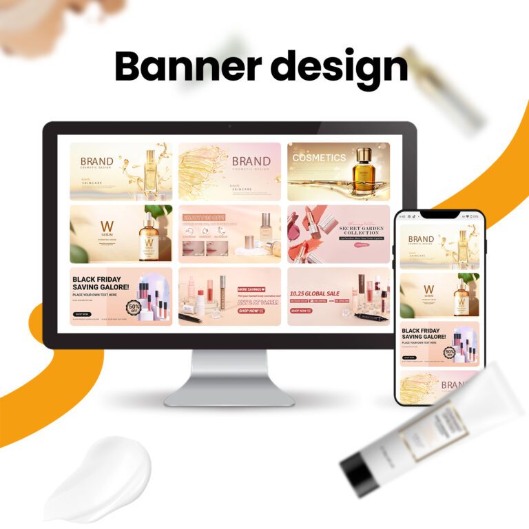
Banners often use large product images paired with minimal, clear copy to showcase core offerings. The goal is to highlight the brand’s selling points at first glance.
Functionality Meets Aesthetics
Beyond beauty, these designs focus on practicality—using layout, color, and structure to guide users through the journey and drive conversions.

The overall content presentation of the homepage pays great attention to the combination of pictures and text. The pictures are conspicuous, the text is refined, and the page layout is relatively simple.

Although the amount of information is not large, the core points and key information are highlighted, which can effectively help users quickly obtain effective information and attract them to view more details.
3.Many domestic official website homepages add technological elements to enhance the sense of luxury, but often ignore the highlighting of brand style.

Domestic users prefer to obtain specific information before taking action, so the impact is relatively small; however, if the independent website continues to use this design, the conversion effect will be greatly reduced. Overseas customers value brands, and independent websites should focus more on brand building and expression.

When designing the first screen of a website, we should focus on personalized display, use design elements and brand symbols, integrate a small amount of industry commonalities, highlight brand characteristics, and leave a deep impression on users.
4.Page relevance
Foreign customers prefer simple and intuitive designs, and avoid overly complex or fancy features. Ensure page relevance, such as clicking on a product on the homepage to jump directly to the detail page. Simplify interactions, improve accessibility and readability, and reduce bounce rates.


Independent sites are vital windows to connect with overseas buyers. At Airsang Design, we specialize in creating websites that align with foreign aesthetic preferences—helping brands attract, engage, and retain users more effectively while boosting exposure, retention, and conversion rates!

