How to Build a Global-Ready Independent Website
In global eCommerce, a strong independent website is key to brand success. At Airsang Design, we build sites that combine bold branding, smart UX, and conversion focus — helping cross-border brands thrive worldwide. Here’s how to create a global-ready site that truly represents your brand.
Common cross-border independent sites: one-screen web design
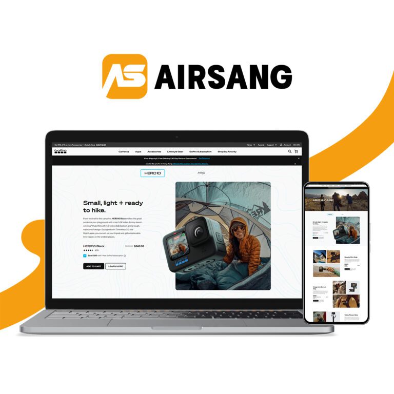
Cross-border independent websites often use one-screen designs, featuring a product image, brief description, and a guide button, unlike information-heavy domestic homepages.

Brand independent websites usually focus on specific categories, and the homepage highlights core products, which helps brand exposure. If all products are stacked on the homepage, it may appear messy, reduce user focus, and even make it difficult to choose.
One-screen webpages can intuitively display brand tone and product application scenarios, creating a high-end and atmospheric visual experience. For small websites with fewer pages, this design is simple and efficient and worth considering. So why is it recommended to use a one-screen website?
When consumers enter the homepage, their attention quickly goes to the main visuals. They can click the image to view product details or swipe to explore more popular items. Scrolling down reveals more products, making shopping faster and easier.
Simple interface
A clean page showcases the brand’s tone, attracting consumers to gain deeper insights and browse more content, which not only prolongs their stay time but also enhances the interaction between users and the independent site.
Adapt to mobile terminals
Mobile users have surpassed computer users. One-screen websites are simple and intuitive on mobile phones, attracting attention, satisfying consumers’ visual experience, and facilitating quick browsing of products.
Cool effect, eye-catching
The high-tech visual effects can bring a unique consumer experience, allowing users to subconsciously feel the high quality and exquisite design of the product.
Design style of well-known domestic cross-border e-commerce independent website
Take a look at the independent website of DJI drones (for the domestic market). You should be familiar with it, right? Its homepage still uses a one-screen design, but the difference is that the official website focuses on product introductions, and purchases require clicking on the mall entrance at the top. The mall entrance uses eye-catching color buttons to guide consumers to the purchase page. In addition, DJI uses a middle layout to highlight the core of the product, which can better attract consumers’ attention.
Segway-Ninebot
Segway-Ninebot’s official homepage also features a one-screen design, but unlike Anker, it uses a centered layout with a carousel, allowing consumers to swipe left and right to view different products.
Anker website
The homepage uses a one-screen layout with a top logo and navigation bar for easy access. Key functions like search, login, and cart sit in the top right. Products are shown in a sleek left-right layout with brief descriptions and a jump button for quick purchase.
Conclusion
Ready to elevate your brand on the global stage? At Airsang Design, we turn vision into high-performing websites tailored for cross-border success. Whether you’re launching or leveling up, let’s create a site that speaks to the world — and converts!

