High Converting Single Product Shopify Web Design
At Airsang Design, we help them turn minimal inventory into maximum impact. In today’s e-commerce landscape, focusing on single product design can be a winning strategy—provided your store design is clear, confident, and converts well.
This article explores the key elements of optimal single product design in Shopify and provides practical strategies and design principles to help you build an efficient store.

Why One Product Stores Work on Shopify
Simplicity Drives Focus and Action
When you sell one product, your website has one job: to persuade. Unlike multi-product catalogs, one-product designs allow for streamlined navigation, messaging, and UX. This focused approach eliminates distraction and guides shoppers toward a single buying decision.
Shopify Is Built for Fast Iteration
Shopify’s intuitive admin, app ecosystem, and mobile optimization make it ideal for testing and refining one-product store designs. A/B tests can be launched, upsell funnels added, and landing page blocks rearranged—without writing code.
Design Must Carry the Weight
With only one item, your visuals, messaging, and layout must do the heavy lifting. Conversion depends not just on product quality, but on how clearly benefits and use cases are presented.
What Defines the Best One Product Design in Shopify?
Every Section Should Push Toward the Purchase
The most effective Shopify one-product stores follow a visual and narrative journey that mirrors a pitch: Problem → Product → Proof → Purchase.
Hero Section
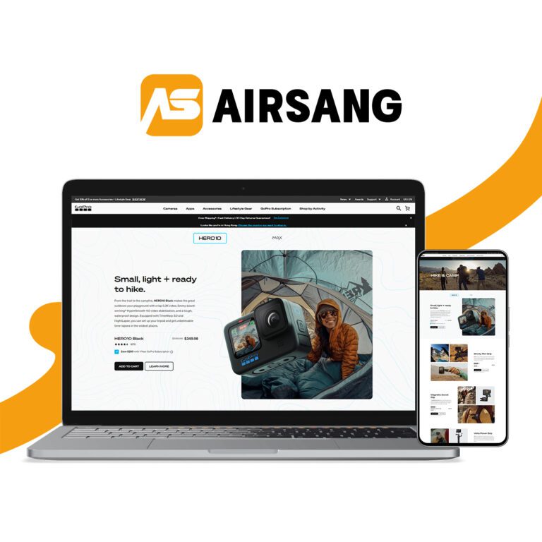
The hero section must instantly communicate the product’s core benefit. Clear copy, a professional product image, and a bold CTA (like “Buy Now” or “See It in Action”) are essential.
Benefit Blocks
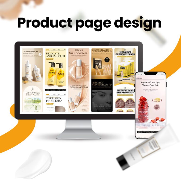
Use alternating image-text blocks to showcase features, pain points solved, and lifestyle integration. Each block should support your core value proposition.
Social Proof and Trust
Include verified reviews, influencer testimonials, or media badges to overcome hesitation. Highlight guarantees, return policies, and secure checkout to reduce friction.
Video Integration
Embedding a short demo video or explainer builds trust fast. In one-product stores, video often outperforms text in engagement and conversion.

Key Elements for Shopify One Product Pages
UX, Speed, and Mobile First
Shopify provides the perfect foundation—but your theme and layout must align with modern eCommerce expectations.
Essential Design Features
- Sticky buy button on mobile
- FOMO-inducing tools (limited stock messages, timers)
- Product variations (colors, sizes) displayed clearly
- Clean, bold font hierarchy
- White space to emphasize CTAs
- Shopify Apps like ReConvert or Frequently Bought Together for boosting AOV
Speed Optimization
Fast load times increase conversions. Use compressed images, minimal external scripts, and lazy loading. Shopify’s CDN helps, but image control remains crucial.
Examples of Best One Product Store Designs
Case Studies That Inspire
While we won’t mention specific brands here, many of the most successful Shopify one-product stores share common traits:
Razor-Sharp Positioning
They solve a specific problem (e.g., posture corrector, portable blender) and explain it in under 5 seconds.
Immersive Landing Page
Scrolling through their homepage feels like watching a well-crafted sales pitch—one step after another building the case for purchase.
Seamless Checkout Flow
Fewer clicks = more conversions. Optimized one-product stores often use Shopify’s dynamic checkout buttons (Buy Now, Apple Pay, etc.).

How Airsang Design Builds Shopify One Product Stores That Convert
Strategy Before Aesthetics
At Airsang Design, we never start with a theme. We start with questions:
- What problem does the product solve?
- Who is the buyer, and what do they need to feel before clicking “Buy”?
- How should the visuals and copy tell a conversion-driven story?
Tailored Themes and Smart Layouts
We build or modify Shopify themes to ensure that every homepage scroll deepens interest. Our designers prioritize clarity, trust signals, and CTA placement.
Mobile Testing and Analytics
After launch, we use heatmaps, analytics, and customer feedback to continuously improve performance. Every store is built to scale, adapt, and sell.
Conclusion: Let Airsang Design Craft Your Best One Product Store on Shopify
A great one-product store isn’t about packing in features—it’s about removing friction. When design, copy, and UX align with product clarity, sales follow naturally.
Airsang Design helps Shopify sellers turn simplicity into strategy. If you’re ready to create the best one product design in Shopify, our team will build you a high-converting storefront that performs—on every screen, in every market.

