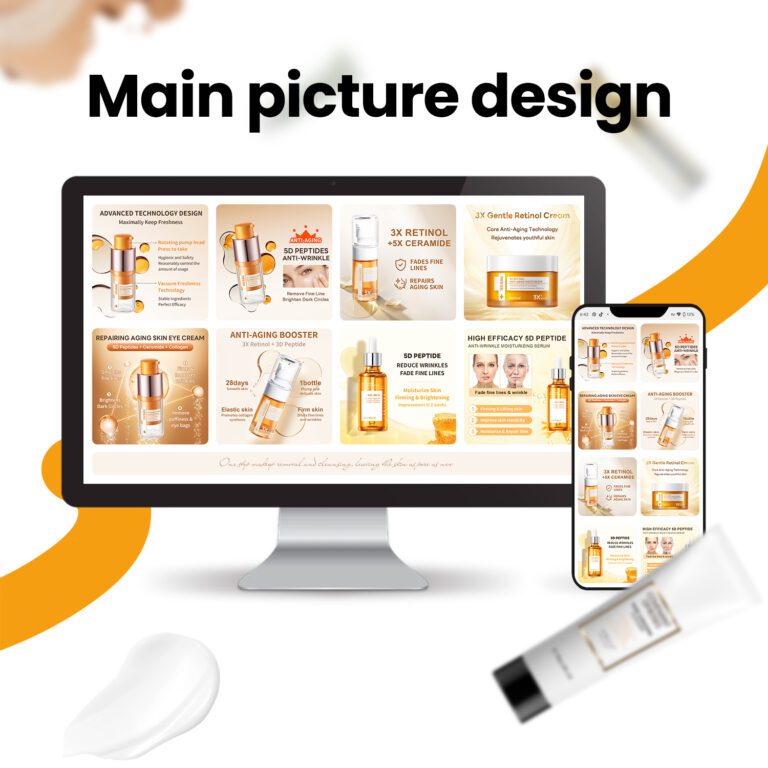
Are your design elements effective in capturing attention?
You have just 0.05 seconds to make an impression online. In that time, your web design must work smarter to capture attention. Are you using the right elements, or are you driving visitors away? At Airsang Design, we’ll explore the key principles to help your website stand out and keep your audience engaged.

Design Elements That Grab Customer Attention
People move quickly online, scanning rather than reading. If something feels off, they’ll leave fast. To retain attention, your web design choices matter. Here are the key elements we focus on when building high-performing websites:
- Colour: Colour sets the tone, guides the eye, and highlights key areas like CTAs. Strong contrast and a consistent palette build brand recognition.
- Typography: Good typography improves readability and creates a visual hierarchy, helping users focus on important content, thereby enhancing accessibility.
- Images: High-quality, relevant images grab attention, add personality, and support your message, making it more memorable.
- Whitespace: Whitespace reduces clutter, focuses attention on key elements, and gives the layout breathing room.
- Animations and Microinteractions: Subtle animations, like button reactions or fading images, guide attention and enhance user experience without overwhelming the site.
- Call-to-Action (CTA): A clear, action-driven CTA encourages clicks and directs users on what to do next, enhancing conversion.
Web Design Pitfalls to Steer Clear Of
Even with the best of intentions, certain design choices can hurt your site’s performance and user experience. Here are seven common mistakes to avoid:
Too much clutter: A crowded page overwhelms users and makes it hard to focus, increasing bounce rates.
Not mobile-friendly: With more users browsing on phones, a site that doesn’t adapt to smaller screens will quickly lose visitors.
Poor contrast: Low contrast, like light grey text on white, makes content hard to read. Clear contrast improves accessibility.
No visual hierarchy: Without a clear hierarchy (e.g. same size/colour for all elements), users are left unsure where to focus. Big headings and bold CTAs guide attention.
Slow loading times: Users are impatient. Slow sites drive visitors away. Optimizing images and reducing scripts can help.
Inconsistent design: Too many fonts, colours, or styles confuse users and damage brand trust. Consistency creates a professional experience.
Hard-to-find CTAs: If CTAs are hidden or unclear, users may miss them. Make buttons stand out and provide clear action prompts.

How to Maintain Visitor Engagement
Want to keep visitors on your site longer? Here’s how:
- Keep your design clean and organized
- Design with your target customer in mind
- Use heatmaps and A/B testing to identify what works
- Make content easy to scan with headings and bullet points
- Speed up your site by optimizing images and code
- Use clear, action-oriented CTAs
- Ensure your site is mobile-friendly
- Regularly refresh content to keep it relevant
- Incorporate engaging visuals to capture attention
Conclusion
At the end of the day, attention is everything. If your website doesn’t grab and keep it, you’re missing out on leads, sales, and brand trust.
The good news? With the right design adjustments, you can make a big impact.
At Airsang Design, we’ve helped many businesses turn their websites into powerful conversion tools. If you’re unsure whether your site’s effective, let’s talk. We offer honest feedback and practical design solutions to boost attention and engagement.
Give us a call today and let us guide you toward the best design choices!

