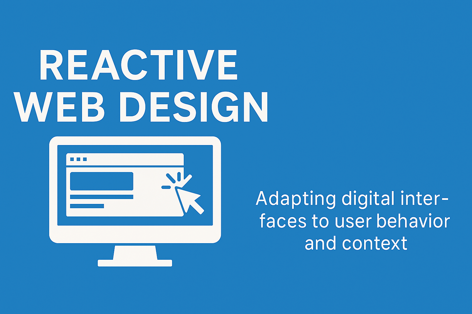
In today’s fast-paced digital environment, user expectations are constantly evolving. Static websites are no longer sufficient. AtAirsang Design, we implement reactive web design strategies that respond to user interaction and contextual behavior in real time—delivering seamless, intelligent, and dynamic experiences across all devices.
What Is Reactive Web Design?
Beyond Responsiveness
While responsive web design adapts layouts based on screen size, reactive web design goes a step further. It considers:
User interaction patterns
Device capabilities
Real-time data
Environmental context (e.g., location, time, motion)
The Reactive Paradigm
Reactive web design focuses on building interfaces that react—not just adjust. This means websites respond dynamically to:
Clicks and scroll behavior
Form input feedback
User history or geolocation
Device motion or connectivity speed
This approach leads to more personalized and efficient user journeys.
Key Benefits of Reactive Web Design
Enhanced User Engagement
By adapting to user inputs and preferences, reactive interfaces increase retention and reduce bounce rates.
Predictive and Personalized UX
Examples include:
Auto-filling forms based on prior input
Offering region-specific promotions
Reorganizing menus based on click frequency
Such micro-interactions make a site feel intuitive and user-centric.
Real-Time Feedback
Reactive design enables:
Instant validation of form entries
Context-sensitive tooltips and alerts
Dynamic loading of components (without full page refreshes)
Increased Accessibility and Performance
Reactively loading content based on network quality or screen resolution ensures accessibility, especially on mobile or low-bandwidth environments.
How Airsang Design Implements Reactive Web Design
Framework and Technology Stack
At Airsang Design, we use frameworks such as:
React.js and Vue.js for dynamic front-end components
Next.js or Gatsby for server-side rendering and speed
Tailwind CSS for responsive styling with reactive utility classes
Progressive Enhancement
We begin with a clean baseline and layer reactive features incrementally. This ensures:
Compatibility across devices and browsers
Graceful fallback in low-resource scenarios
Modular Component Strategy
Each UI element is built as an independent reactive module. For example:
A login form that reacts to incorrect passwords with live hints
A pricing table that updates dynamically with toggle inputs
Real-Time Analytics and Adaptation
We integrate behavior tracking tools (like Hotjar or Google Tag Manager) to inform layout and interaction refinements. This continuous feedback loop ensures the design evolves with actual user behavior.
Reactive vs. Responsive: What’s the Difference?
A Comparison of Web Design Approaches
Feature
Responsive Design
Reactive Design
Screen Adaptation
Yes
Yes
Real-Time Interaction
No
Yes
Context Awareness
Limited
Advanced
Personalization
Minimal
High
Load Efficiency
Static
Dynamic
Reactive web design builds on the foundation of responsive design but elevates it through interaction intelligence.
Conclusion
Reactive web design is the future of digital experience—dynamic, user-aware, and adaptive. At Airsang Design, we specialize in crafting interactive, intelligent websites that adjust in real time to how users engage with them. Whether you’re building a new platform or upgrading an existing one, our team ensures your website remains one step ahead of user expectations.
Let Airsang Design help you transition from static interfaces to truly reactive digital experiences.
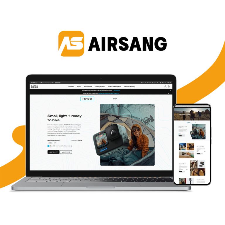
In Shopify web design, true excellence lies in the details. At Airsang Design, we believe that every pixel, layout choice, and interaction should serve both...
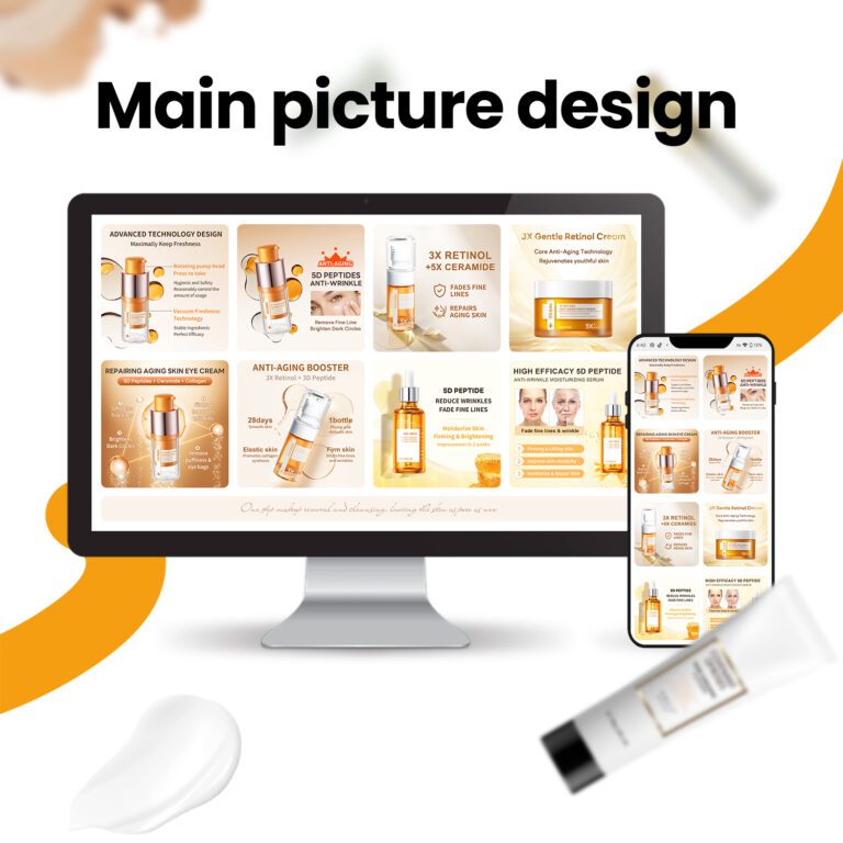
At Airsang Design, we believe the smart use of lines and colors is key in independent website design. Thoughtful combinations not only enhance visuals but...
Design is everywhere, from product appearance to architecture, advertising layouts to user experience, profoundly impacting our lives. So, what is design? Is it merely beautification,...
With the rise of online shopping, fashion brands face challenges in building trust without physical interaction. At Airsang Design, we emphasize the power of beautiful...
Google values not only the amount of content on a website but also its presentation and quality. At Airsang Design, we emphasize creating well-designed websites...
At Airsang Design, we believe in the top-down design approach, starting with the overall goal and progressively breaking it down into smaller components. This contrasts...
At Airsang Design, we emphasize the importance of proportion in website design. The right proportion of page elements—such as text, images, and buttons—creates balance and...
“Fantastic” designs break traditions, inspire creativity with unique forms, functions, or concepts, and brighten up daily life. At Airsang Design, we share 5 creative designs...


 09Apr
09Apr