At Airsang Design, we emphasize the importance of proportion in website design. The right proportion of page elements—such as text, images, and buttons—creates balance and harmony, while improper proportions can disrupt navigation. A well-considered proportion highlights key content and enhances website flow.
Guide to Ideal Proportions in Web Design
In web design, following certain proportion principles can ensure visual appeal. Here are some commonly used effective proportion principles:
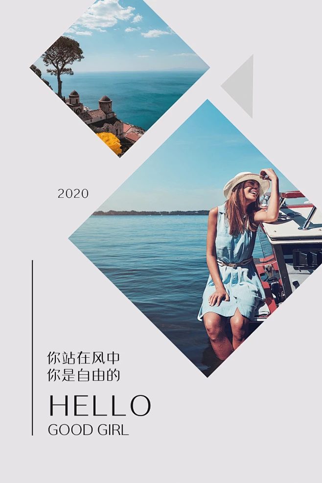
The golden ratio (1:1.618) creates natural balance in web design. It helps define proportions for images, text, and layout elements.
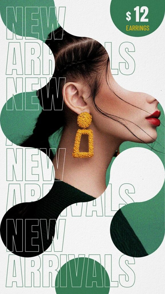
The rule of thirds originated from photography. It divides the picture into a 3×3 grid and places key elements on the grid lines or intersections to help highlight the focal point and avoid confusing the audience.
Modular grid system
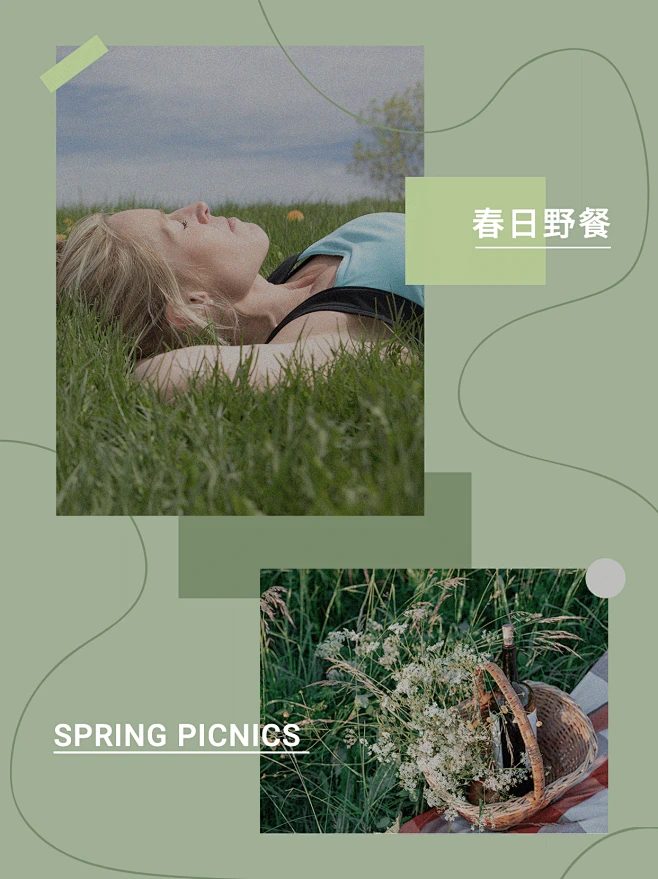
The modular grid system divides the page into equal blocks, ensuring that elements fit the overall design and maintain proportional relationships. Web designers can use CSS Grid or Flexbox to adapt to different screen sizes.
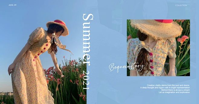
Maintaining a consistent aspect ratio (e.g., 16:9 for videos, 4:3 for images) creates a clean, unified design, avoids distortion, and balances page elements.
The 60-30-10 rule is a color theory that recommends using 60% of the primary color, 30% of the secondary color, and 10% of the accent color to create visual harmony and highlight the key points while avoiding excessive clutter.
Is Proportion Important in Design?
Proportion is crucial in design because it directly affects the user experience of a website. Adhering to the principles of proportion ensures that the website is both aesthetically pleasing and easy to navigate and interact with.
Readability and legibility A well-proportioned website can convey information more easily. Appropriate text size, paragraph spacing, and image-text balance improve readability and avoid users struggling to read.
Visual hierarchy is created through proportion, helping users focus on what to focus on. Larger elements (such as headings or buttons) draw the eye and indicate their importance; smaller elements (such as body copy or secondary links) guide the flow of browsing without distracting from the main content. Proportion maintains this intuitive hierarchy.
Avoid clutter
Improper proportions of elements (such as different sizes or uneven spacing) will make the design cluttered and make it difficult for users to focus on key information. Proper proportions can ensure a simple design and give each element enough space.
Improve navigation
Reasonable proportion design can improve the navigation experience, and appropriate spacing and element size make users move more smoothly. For example, a well-proportioned navigation bar ensures that links are clear and buttons are easy to click, and a uniform proportion helps users quickly find what they need.
Website design affects user interaction. Well-designed CTAs, images, and titles can attract user participation. CTA buttons of appropriate size and prominent position can encourage user action, enhance trust and interactivity.
Common Mistakes and How to Avoid Them:
In web design, proportions are often overlooked or misused. Here are some common mistakes and how to fix them:
Ignoring the Golden Ratio: Not strictly following the Golden Ratio can lead to an unbalanced layout. While you don’t have to rely on it completely, it helps to create a harmonious design.
Inconsistent Spacing: Inconsistent spacing destroys balance. Keeping padding and margins consistent is essential.
Overly complex layouts: Too many elements can confuse users. Keep a simple, balanced design, focus on the essentials, and use proportions to guide the eye.
Conclusion
When designing a website, avoid overly complex features and details. Using proportions can create a simple, harmonious layout, improving the practicality and beauty of the design.
If you are interested in these contents or want to know how to optimize your independent website, please feel free to contact airsang design!
One comment
ByteRider
Really helpful breakdown of top-down design. I appreciate how you made the technical aspects approachable—especially the part on modularity and team collaboration.
In Shopify web design, true excellence lies in the details. At Airsang Design, we believe that every pixel, layout choice, and interaction should serve both...
At Airsang Design, we believe the smart use of lines and colors is key in independent website design. Thoughtful combinations not only enhance visuals but...
Design is everywhere, from product appearance to architecture, advertising layouts to user experience, profoundly impacting our lives. So, what is design? Is it merely beautification,...
With the rise of online shopping, fashion brands face challenges in building trust without physical interaction. At Airsang Design, we emphasize the power of beautiful...
Google values not only the amount of content on a website but also its presentation and quality. At Airsang Design, we emphasize creating well-designed websites...
At Airsang Design, we believe in the top-down design approach, starting with the overall goal and progressively breaking it down into smaller components. This contrasts...
“Fantastic” designs break traditions, inspire creativity with unique forms, functions, or concepts, and brighten up daily life. At Airsang Design, we share 5 creative designs...


 09Apr
09Apr


One comment
ByteRider
Really helpful breakdown of top-down design. I appreciate how you made the technical aspects approachable—especially the part on modularity and team collaboration.