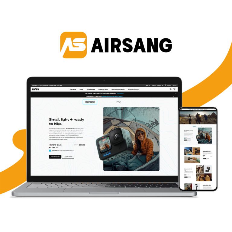
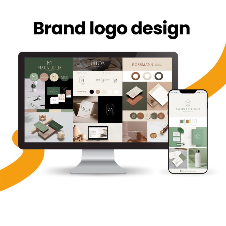
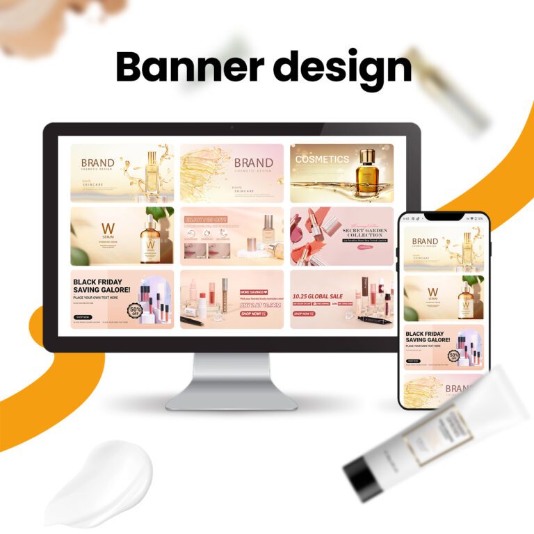
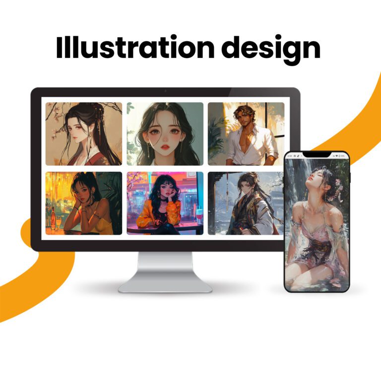
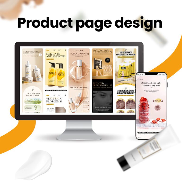
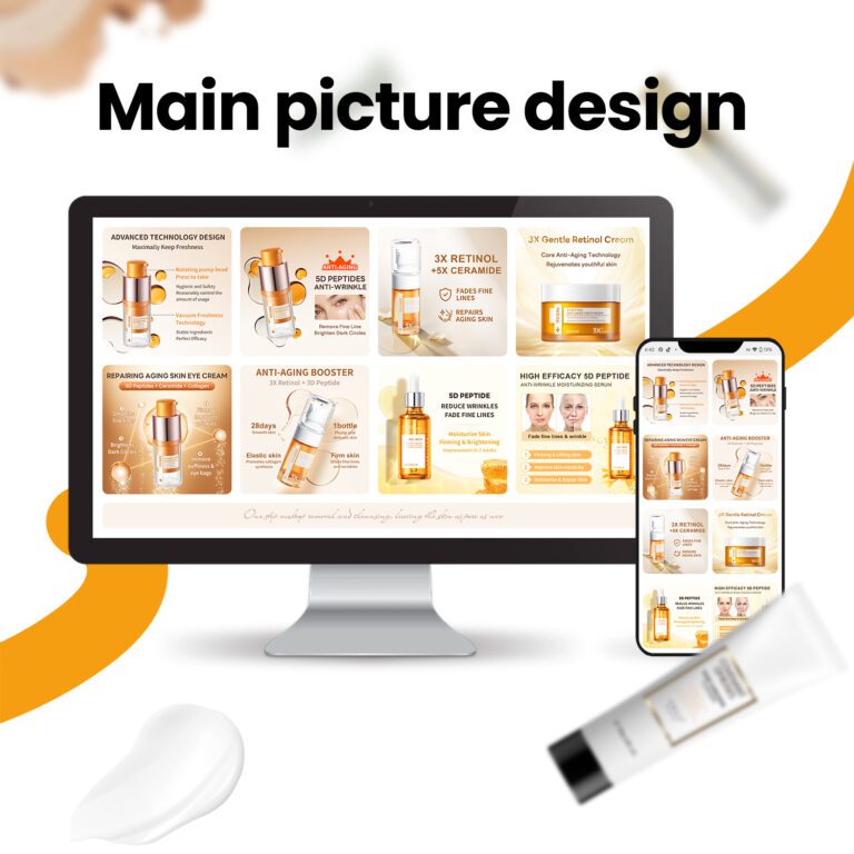
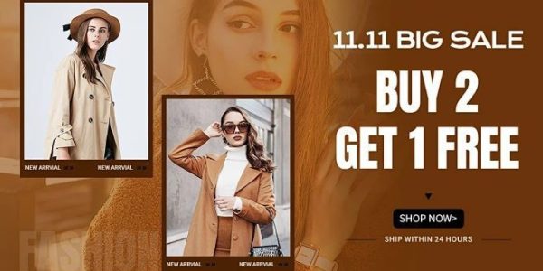
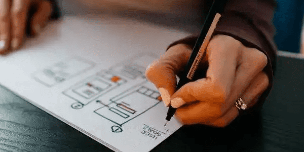
Foreigners will prefer independent sites designed this way!
When designing an independent website, in addition to showing the uniqueness of the brand, it is more important to understand the preferences and aesthetics of the target overseas users to ensure that the design matches their preferences, attracts customers and stimulates brand exploration. Foreign websites usually prefer simple and rigorous color combinations, such as light black, white and blue, as well as simple graphics and icons to make the design more international, even for large websites.

Different websites and user groups have different style preferences, depending on the industry, target audience and brand characteristics. The following are some common design styles for overseas websites:
1.Graphic design style

Focus on concise and clear layout and use of large color blocks, reduce unnecessary decoration, and highlight the information transmission. Just like writing clearly on a clean white paper, avoiding interference and making it clear at a glance.
2.Flat design style

This style uses simple icons, bright colors, clear typography, and responsive layouts, with fewer shadows and textures. The seemingly simple colored squares, lines, and icons are carefully laid out to ensure clarity on any device.
3.Material design style

The design launched by Google focuses on realism, emphasizing three-dimensionality, layering, changes in light and shadow, bright colors and rounded shapes to create a modern and fashionable visual effect.
4.Illustration and hand-drawn style

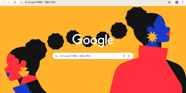
The vivid and abstract hand-drawn illustrations convey information and increase interactivity. This style is like asking an artist to draw a story for you, full of interesting characters, animals and scenes to attract attention.
5.Image and video background styles

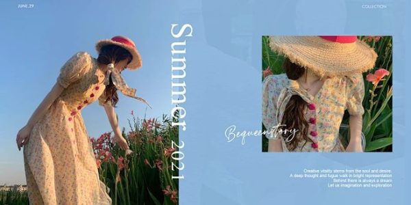
Use large-size, high-resolution pictures or videos as website backgrounds to enhance visual impact and brand image, and create an immersive and shocking experience.
6.Card-style design

The card-style design divides the content into independent units, each of which is displayed like a postcard, with a clear and concise structure, suitable for browsing on mobile devices. Each card is independent, neat and easy to view on mobile phones.
7.Responsive design style

It focuses on the browsing experience of different devices, automatically adapts to the screen size and resolution, and ensures comfortable and convenient browsing whether on a mobile phone, tablet or computer.
If you are interested in these contents or want to know how to optimize your independent website, please feel free to contact airsang design

