Luxury Brand Website Design Strategy
In the luxury sector, consistency is key. Ensure the digital experience reflects brand quality with engaging design, optimized conversion, and intuitive UX, as 75% of consumers assess brand credibility through website design. Here are four strategies for success.
Monards (Crown Casino)
Minimalism as a Foundation for Luxury Websites
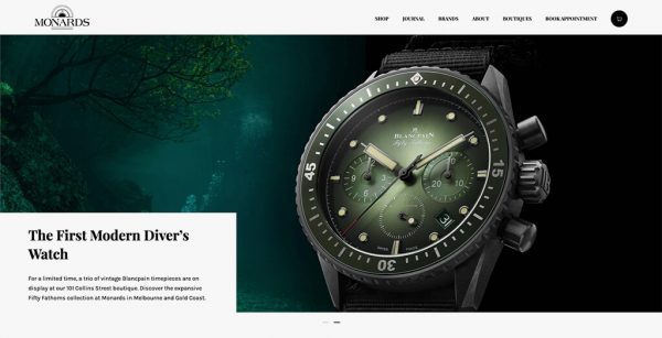
Monards, located in the Crown Casino building, offers luxury jewelry and watches from top brands like Piaget, Chopard, Longines, and Bulgari. With 81% of customers researching online before visiting, Monards needs to create a refined digital experience to match its in-store luxury.
Timeless Design Over Complex Features
While many believe luxury websites need complex elements, Monards’ website adopts a minimalist approach. Using elegant fonts, a simple layout, and plenty of white space, it lets the stunning watch and diamond imagery take center stage. This approach highlights the brand’s craftsmanship while maintaining a sophisticated, timeless aesthetic.

Yongdali Stone
YDL Stone: Elevating Luxury Quartz Surfaces
YDL Stone, a preferred supplier for commercial architects and luxury residential developers, sought to enhance its brand visuals and attract high-end clients.
Design Strategy Highlights:
- Luxurious Gold Pattern: Hexagonal gold elements emphasize the brand’s premium image.
- Architectural Inspiration: Thin vertical lines inspired by architectural drawings resonate with the target market.
- Elegant Home Elements: Reflects the lifestyle and quality of high-end homeowners.
These strategies help YDL Stone solidify its leadership with a distinctive visual language.

Rylock Windows and Doors
Show Off Your Assets and Showcase Your Brand
Rylock, a leader in the Australian construction industry, is known for its award-winning projects and advanced manufacturing facilities. Maintaining brand continuity through a seamless digital platform was essential.
Design Strategy for Impact
- 3D Cut-Out Image: Highlights the high construction standards.
- Two-Column Layout: Combines static photos with lifestyle images.
- Minimalist Gallery Slider: Adapts to content storytelling needs.


Automate

Building a Global Digital Platform for Automate
Automate, known for its advanced rechargeable smart sunshade motor, provides innovative smart home technology for discerning homeowners and luxury developers. With the pandemic shifting digital expectations, 68% of consumers now demand more digitalization from businesses. As a result, Automate must build a global platform to showcase its technology and support multilingual translation.
Streamlined Design for High-End Appeal
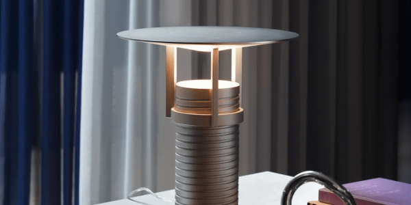
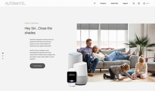
In the luxury market, less is more. Consumers value the overall brand experience over lengthy content. We simplified the design with a clean content structure, reduced information blocks, and increased white space to create a visually comfortable and elegant website.
Creating a Relaxed, Sophisticated Atmosphere
This approach fosters a relaxed atmosphere, avoiding cluttered content or exaggerated headlines. Through high-quality photography, refined image cuts, and smooth video animations, the website highlights Automate’s technology and premium user experience with simplicity and elegance.
Conclusion
Content design is crucial in visual design, requiring a balance between elegance and excess. At Airsang Design, our creative team collaborates with clients to ensure websites are trustworthy and offer an informative, user-friendly experience, tailored to the industry and target audience.

