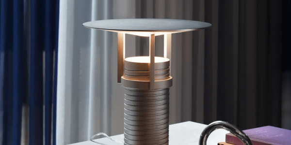
A feast of lines and colors
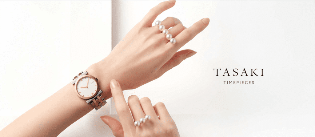
As a high-end jewelry brand, TASAKI’s official website—crafted by Airsang Design—perfectly reflects the brand’s sophistication and elegance. The minimalist design uses precise lines and soft colors to create a luxurious, artistic visual experience.
one. modern luxury and seamless design
1.Artistic use of lines
The overall design of the website is based on clean lines, emphasizing the beauty of modernity and simplicity.
Product Display: The contour lines of the jewelry echo the website design, highlighting the brand’s iconic style.

Ample white space highlights text and visuals, improving focus and enhancing the overall reading experience for TASAKI’s website users.
Fine dividing lines unify sections and improve clarity, making TASAKI’s website navigation clean, structured, and easy to follow.
two.elegant harmony of colors and pearls
2.Color coordination
Low-saturation tones like pink and lavender blend with pearls, creating TASAKI’s warm, elegant, and refined visual atmosphere.
Main visual color: The soft pink background gives the page a sense of warmth, echoing the luster of the pearls.

Similar tones like lavender and light green distinguish sections, creating visual harmony across product pages and enhancing user experience.

Bright contrasting colors highlight key info like new arrivals and exclusives, enhancing visual appeal and drawing user attention effectively.
three.a seamless blend of art, technology, and modern elegance
3.Combination of dynamic and static
In addition to static images and colors, the website also adds dynamic interactive experience through animation effects.
For example:
Hovering slightly enlarges products or adds shadows, helping users intuitively sense the jewelry’s fine details and craftsmanship.
When the page scrolls, different sections transition smoothly, bringing a smooth browsing experience.
The gradient color design of the interactive button gives users a subtle sense of feedback when they click it.
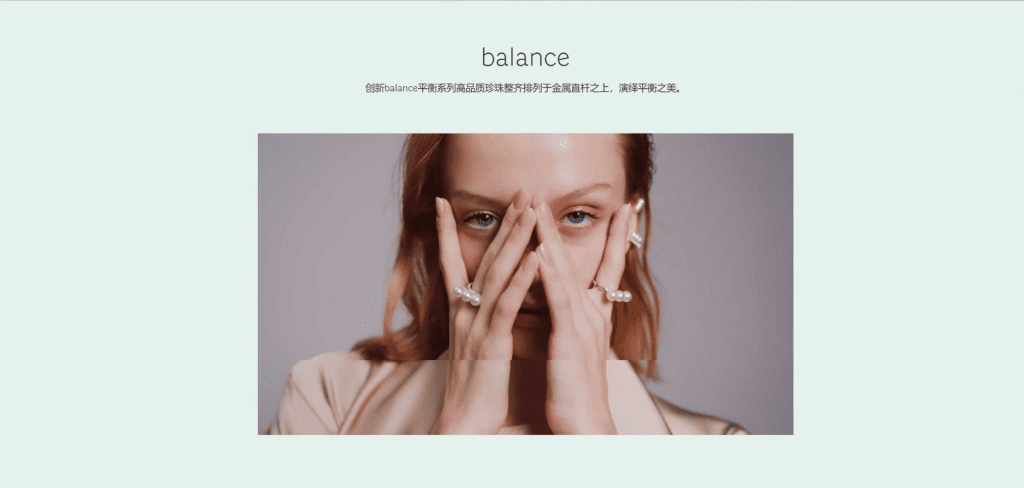
TASAKI’s website blends art and technology with soft colors, simple layout, and smooth interactions, reflecting modern elegance. This design concept that combines art and technology is the best example of the modern luxury e-commerce experience.
Conclusion
If you need customized web design, please contact airsang design, bye!


