Shopify independent website design sharing
These 6 websites have different styles, there is always one that suits your aesthetic!
Haus
The Haus website is dominated by soft neutral colors such as cream, light gray and beige, conveying the brand concept of nature, health and simplicity and creating a relaxing and comfortable atmosphere.
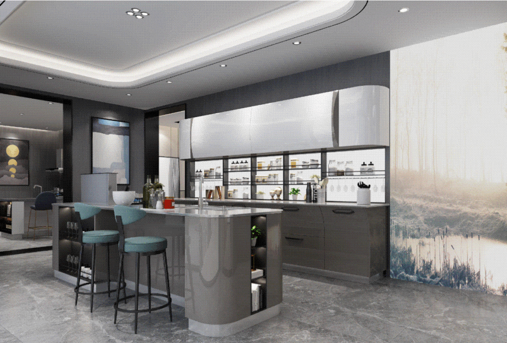
The website uses large high-definition pictures to show the product texture and usage scenarios. The layout and color matching are consistent with the overall tone, which enhances visual coordination and perfectly displays the minimalist style.
Omsom
The Omsom website uses bold color combinations such as orange, pink, and red, combined with large images and graphic elements, and the product images complement the background design.
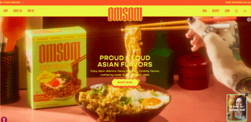
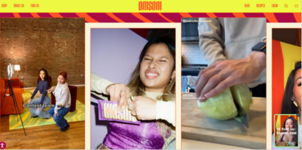
These bright colors convey the brand’s vitality and uniqueness, creating a strong visual impact, while incorporating video elements to showcase the brand’s diversity.
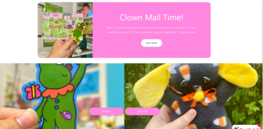
CyberClownCo
CyberClownCo’s website uses bold color combinations, and the bright colors complement the brand’s avant-garde image, bringing a strong visual impact. The visual effect combines futuristic and retro elements, such as retro pixel graphics intertwined with modern 3D effects, creating a unique experience. The layout breaks the traditional rules, and the retro and futuristic fonts are arranged randomly to create a fun and free cyberpunk atmosphere.
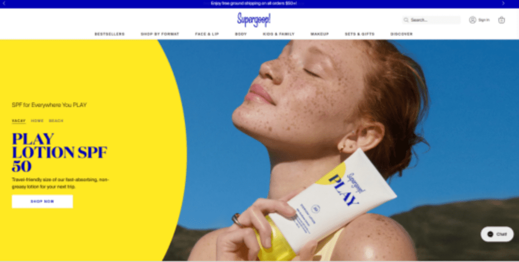
Supergoop
The Supergoop website uses a bright and fresh color scheme of white, yellow and blue, symbolizing sunshine, vitality and cleanliness. The yellow conveys a warm and sunny feeling, while the blue brings a refreshing and reassuring impression, which perfectly fits the theme of sun protection. The website design is full of vitality, creating a positive atmosphere and attracting attention through large areas of color blocks, simple graphics and high-quality product pictures.
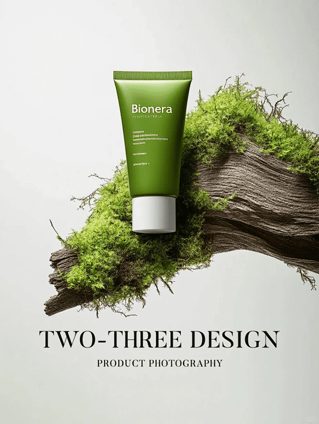
Golde
Golde’s website uses fresh tones such as soft pink, light yellow and green to convey a sense of nature, health and pleasure. The light tones bring a comfortable and relaxing visual experience, and large areas of white space and carefully arranged pictures create a sense of visual hierarchy. The product pictures are harmoniously matched with the background, highlighting the natural and pure characteristics.
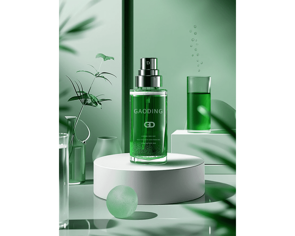
Everyday Needs
The Everyday Needs website is mainly white, gray and light wood, conveying a sense of tranquility, nature and freshness, which is in line with the brand’s high-quality, low-key luxury image. A large number of high-quality still life photography highlights the product design details and material texture, and the minimalist background makes the product beauty more prominent.
If you are interested in these contents or want to know how to optimize your independent website, please feel free to contact airsang design

