In adult eCommerce, trust and presentation are vital. SexDollTech sought a homepage that boosts conversions while staying true to its brand. Our goal was to blend visual appeal, user confidence, and functionality into one seamless experience—this case study explains the strategy behind every design decision.
Table of Contents
First Screen Banner: Driving Promotions and Urgency
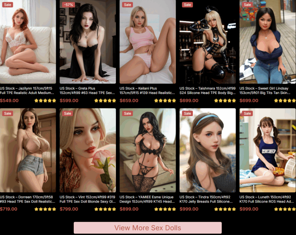
Product Grid: Eye-Catching Thumbnails That Convert
Function Video Section: Boosting Trust With Demonstration
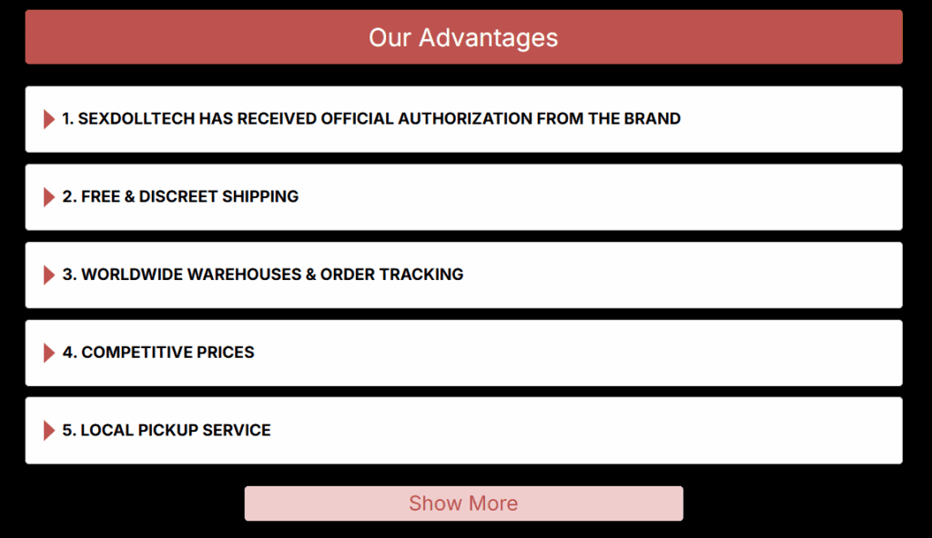
Advantage Accordion: Building Credibility and Reassurance
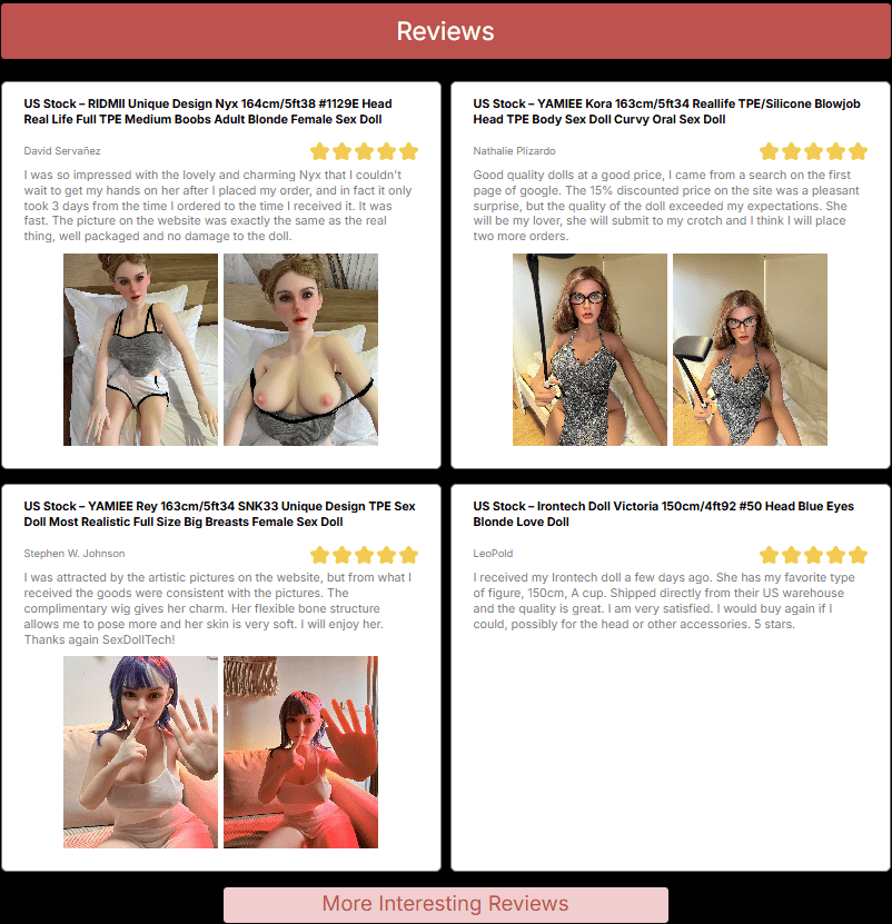
Reviews Section: Humanizing the Experience
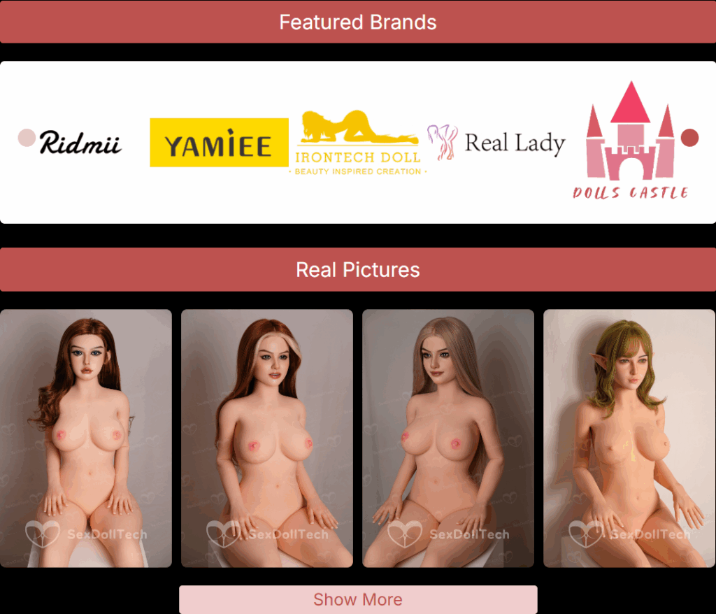
Brand Showcase & Real Photos: Reinforcing Authenticity
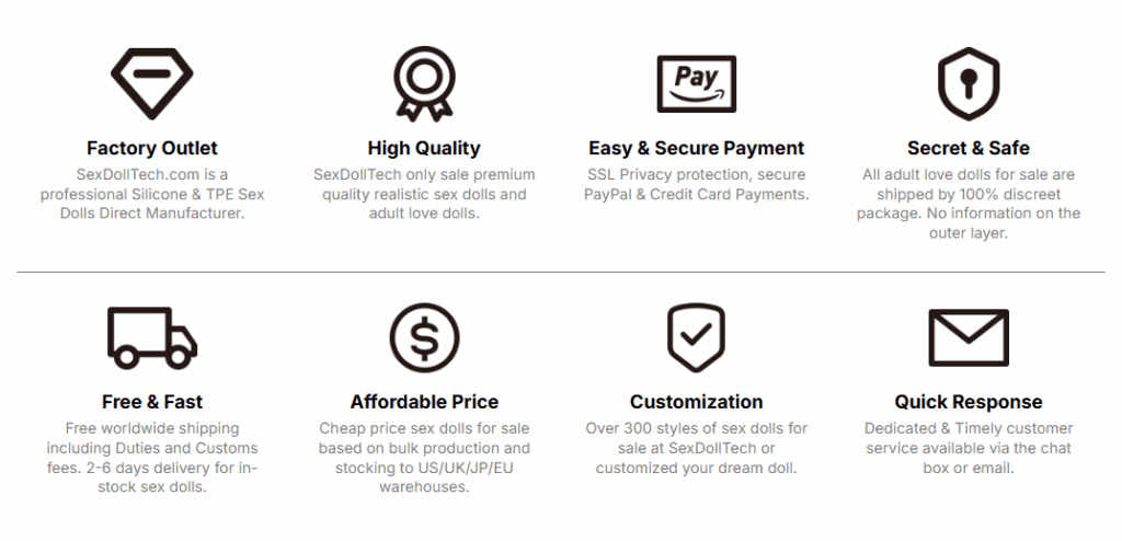
Feature Icons Section: Establishing Value Propositions
FAQ Accordion: Reducing Purchase Friction
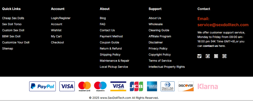
Footer Layout: Informational Depth with Functional Balance
Contact info & payment methods establish legitimacy.
Minimal visual clutter for easy reading and interaction.
The footer helps tie together brand, service, and support seamlessly.
Final Thoughts
This homepage for SexDollTech was not just about sleek design. Every section was built to address a specific user mindset, reduce bounce rates, and encourage purchases. From emotional urgency to logical reassurance, we created a narrative that transforms visitors into loyal customers.
Web design is the “face” of an independent website, and at Airsang Design, we emphasize creating visually striking designs that align with the brand concept...
As the pet economy grows, the dog collar market faces intense competition. Consumers now prioritize quality, design, and added value over basic safety. With price...
Attracting users and keeping their attention is the key to high conversion rates and engagement. Mastering this is the key to creating memorable websites that...
In the increasingly fierce competition of cross-border e-commerce, having a high-quality independent website has become the key to brand success. As the world’s leading e-commerce...
Today we bring you the new logo design of the “Athena Art” dance training class! The design inspiration comes from Athena, the ancient Greek goddess...
YaZoo Pet Life Center LOGO design concept (2) Font designThe “YaZoo” brand name uses a modern and simple sans serif font, which has strong readability...
These 6 websites have different styles, there is always one that suits your aesthetic! Haus The Haus website is dominated by soft neutral colors such...


 30Apr
30Apr


")

