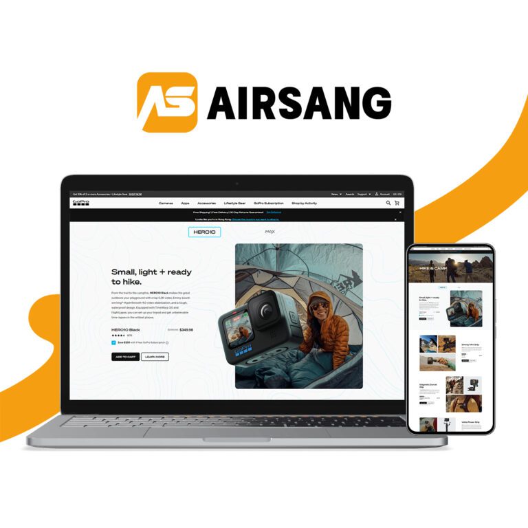
Coined by Ethan Marcotte in 2010, “responsive web design” refers to websites that adapt fluidly across all screen sizes. But at Airsang Design, we go beyond basic responsiveness—crafting truly adaptive layouts with flexible grids and fonts that deliver seamless experiences on phones, tablets, and laptops.
With global mobile usage on the rise, our design approach is backed by real data—not guesswork—so you know exactly where to optimise for better engagement and conversions.
Mobile Web Design Trends and Data
By 2021, global internet users reached 4.6 billion—double that of 2010. Nearly 90% of adults expect mobile websites to perform as well as desktops. Over 50% of smartphone users prefer browsing mobile sites over downloading apps, and consumers rank visuals like images (40%), color (39%), and video (21%) as key design elements. On average, people now spend over 3 hours daily on their smartphones.
Mobile-Friendly UX and Changing User Behaviors
Mobile usability matters:
74% of users return to mobile-friendly sites
72% expect businesses to offer mobile-ready design
53% leave if loading exceeds 3 seconds
79% bounce if the site isn’t mobile-optimized
88% take action (call/visit) within 24 hours of mobile search
Long content? 30% switch devices, 38% abandon the site
Let me know if you’d like it in sentence form or styled for SEO landing pages.
Why Responsive Design Matters in Digital Marketing
Google now prioritises mobile-friendly websites in search rankings. Since launching mobile-first indexing globally in 2018, responsive design has become essential. Today, 68% of companies include mobile in their marketing strategy, and mobile video ads generate the same share of digital video revenue.
Why Responsive Design Is Critical for Mobile eCommerce Success
Mobile commerce is booming—53.9% of retail eCommerce came from mobile in 2021, and 79% of users shopped via mobile in the past 6 months. Companies with mobile-first design saw a 68% sales boost, and mCommerce is expected to reach 75% of all digital sales by 2023.
Case studies:
Plusnet saw a 10x sales increase post responsive redesign.
Blazing Saddles grew mobile traffic by 74% and total traffic by 40% after going responsive.
Moving Forward with Mobile Design
With mobile usage surging across all age groups, responsive web design is no longer optional. To help you get started, Airsang Design has created a simple mobile optimization checklist for your team.
Responsive Design Best Practices:
Flexible navigation that adapts to screen sizes
Clean, simple layouts for easy viewing on small devices
Clear, readable text—no shrinkage
Clickable phone numbers (not images) for tap-to-call
Balanced white space for scannability
Larger input fields for easier form submissions
A mobile-friendly site improves both user experience and conversions.
Conclusion
At Airsang Design, we believe responsive design is key to user satisfaction and business growth. A well-optimized mobile site boosts engagement, conversions, and trust—ensuring your brand performs beautifully on every device.
Some websites instantly grab attention, while others feel bland. It’s not just titles, buttons, or images that matter—background (B/G) content also plays a key role....
Your website determines the first impression that potential customers have of your brand. Whether you are starting a new business or redesigning your website, choosing...
Metadata is a critical concept that often goes unnoticed and impacts the success of a website. Whether you are a web designer, developer, or business...
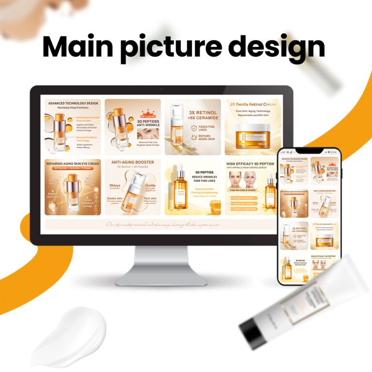
The Amazon Enhanced Brand Content (EBC) template you design uses a “modular” system. These modules are interchangeable visual and text elements that you can freely...
The sales pipeline is key to business growth, responsible for nurturing leads, converting customers, and generating revenue. An unoptimized pipeline or process holes can hamper...
Careful design not only enhances the visual appeal of your company’s events, but also optimizes the user experience and improves the overall impact. Effective design...
With the rapid development of cross-border e-commerce, user experience is crucial. Shein is well aware that optimizing UI design can improve user experience, especially in...


 11Aug
11Aug