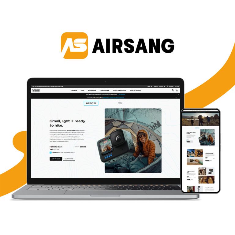
How Poor Mobile Design Hurts the Online Shopping Experience
Ever struggled with tiny text, slow loads, or unclickable buttons on mobile? Your customers might be, too.
At Airsang Design, we know poor mobile design can ruin the shopping experience and drive visitors away. In this post, we’ll break down what unresponsive design means, how it hurts your store, and how to fix it.

What Is Non-Responsive Web Design?
A responsive website adapts to any screen—desktop or mobile—ensuring it looks and functions well everywhere.
In contrast, an unresponsive design may appear fine on desktop but break on mobile, with cut-off images, tiny buttons, and unreadable text—leading to user frustration and lost sales.
Mapping the Customer’s Online Shopping Experience
The online shopping journey includes key steps: landing on your site, browsing, viewing products, checking out, and returning. If any step—especially on mobile—is confusing or slow, it can break the flow and cost you a sale.
That’s why smart, responsive design should support every stage and guide users smoothly from start to finish. Let’s explore how poor design disrupts this journey.
How Poor Mobile Design Creates Friction in the Customer Journey
1) Poor First Impressions
If your site looks messy or broken on mobile, users will leave within seconds—it signals low trust and poor usability.
2) Difficult Navigation
Broken menus, unreadable text, and hard-to-tap links make browsing frustrating and drive users away.
3) Unclear Product Pages
Mobile users need clear images and info. A cluttered layout hurts trust and causes missed conversions.
4) Checkout Friction
Slow loads, tiny fields, or confusing forms can lead to cart abandonment—even from ready buyers.
5) Lost Loyalty
Bad mobile experiences reduce return visits and damage word-of-mouth. Good design helps turn first-time buyers into loyal customers.
The Business Impact of a Bad Online Shopping Experience
Unresponsive design isn’t just a tech issue—it costs you real sales. When users get frustrated, they leave, and competitors are just a click away.
Ignoring the customer experience can lead to:
- Lower conversions
- Poor mobile SEO rankings
- Negative reviews
- High bounce rates
Improving design means protecting revenue.
How to Improve and Fix a Non-Responsive Website
If your site isn’t mobile-friendly, don’t worry—there are clear steps to fix it. Improving responsiveness boosts user experience and sales.
At Airsang Design, we help businesses build high-converting, mobile-optimised websites. Here’s how:
- Full site audit across devices
- Mobile-first, responsive design
- Clean UX/UI for smooth navigation
- Fast, performance-optimised pages
- Flexible layouts for all screen sizes
- Conversion-focused strategy
- Ongoing support to keep your site updated and responsive
Conclusion
Your website is your brand’s first impression—if it fails on mobile, users may not return.
At Airsang Design, we build responsive sites that not only look great but also earn trust and drive sales. Not seeing results? Let’s talk. Contact us for a free consultation and create a site that works beautifully on every device.


