We partnered with NutriFortune to design a compelling and benefit-focused product detail page for their Alaska Salmon Omega-3 Softgels. The visual structure guides shoppers through science-backed benefits across age groups, reinforcing trust, transparency, and wellness impact in every scroll.
Clearly communicates the health benefits for children, adults, and seniors
Visually explains the functional components (DHA, EPA, Vitamin E)
Builds brand trust through dosage instructions, ingredient transparency, and lifestyle relevance
🧠 Core Visual Highlights
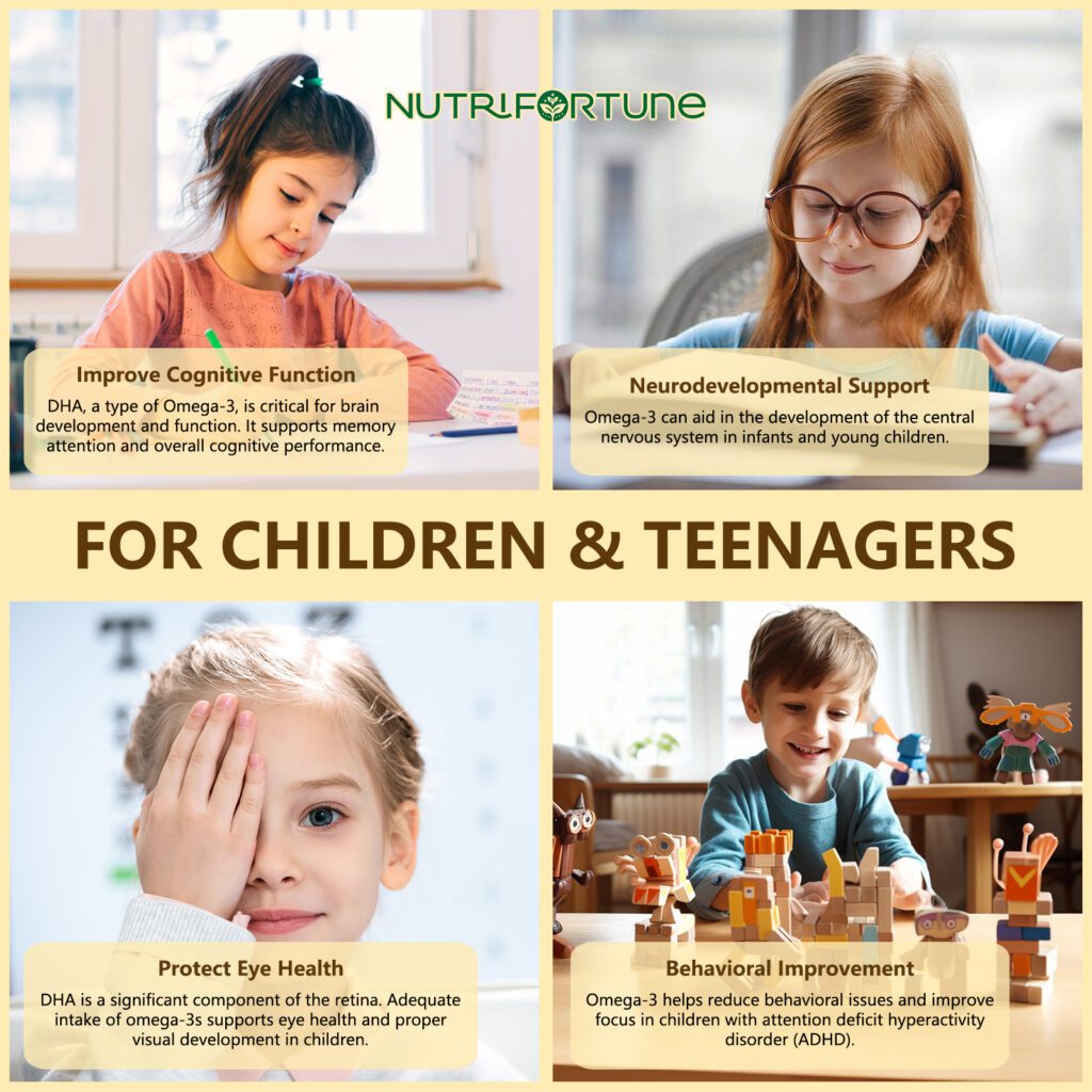
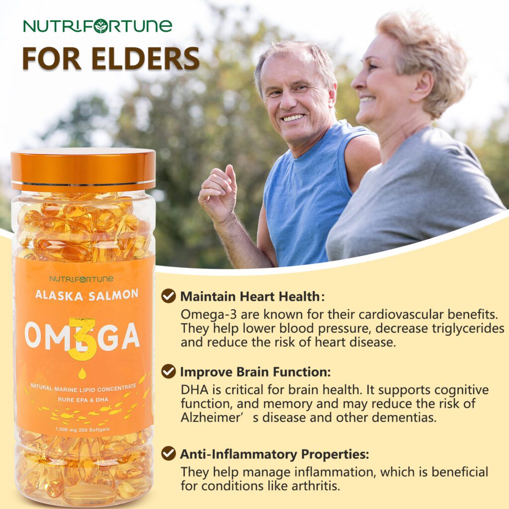
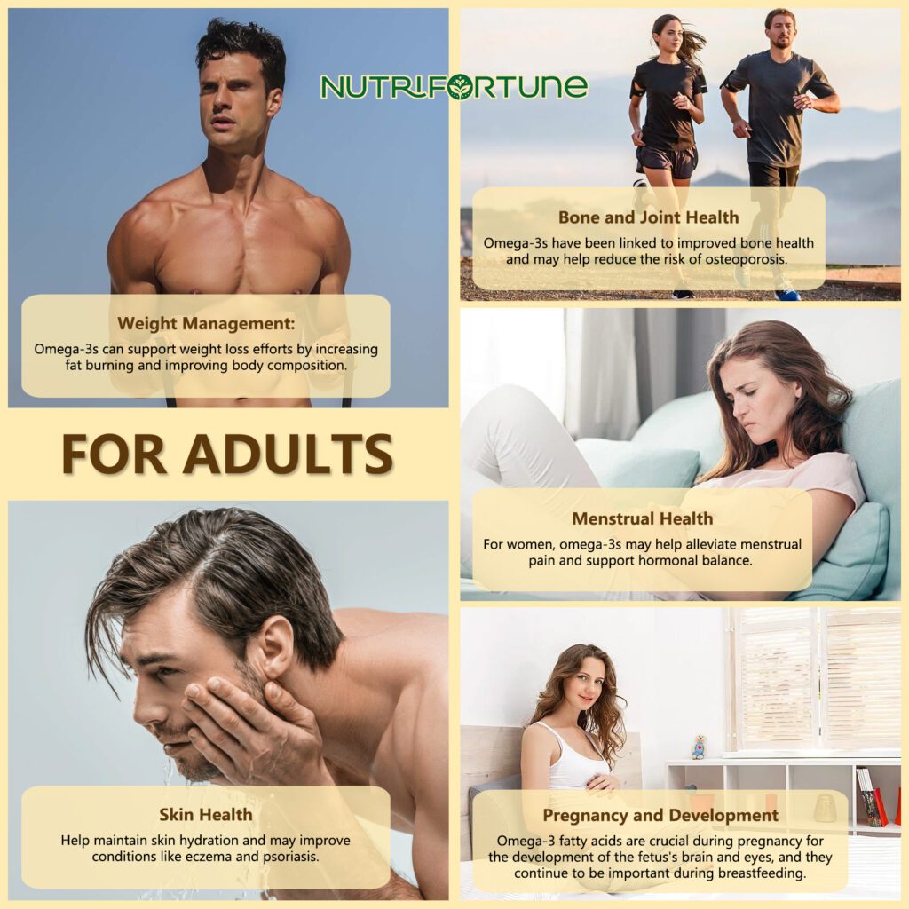
① Age-Specific Health Benefits
We opened with modular lifestyle visuals categorized by life stage:
For Children & Teenagers: Focused on cognitive support, eye health, neurodevelopment, and behavioral balance (especially for ADHD).
For Adults: Addressed weight management, skin health, hormonal balance, and prenatal support—backed by relatable imagery and wellness cues.
For Elders: Presented brain function, cardiovascular health, and anti-inflammatory relief with active lifestyle visuals to enhance credibility.
Each section was unified with warm, trustworthy tones and clearly labeled benefit boxes.
② Key Ingredient Breakdown
To communicate product quality and functional clarity, we visualized the core ingredients in a capsule cutaway:
Omega-3 Fatty Acids
EPA for inflammation and cardiovascular health
DHA for brain and eye development
Vitamin E for antioxidant protection
We used a macro-style aesthetic to elevate perceived purity and formulation transparency.
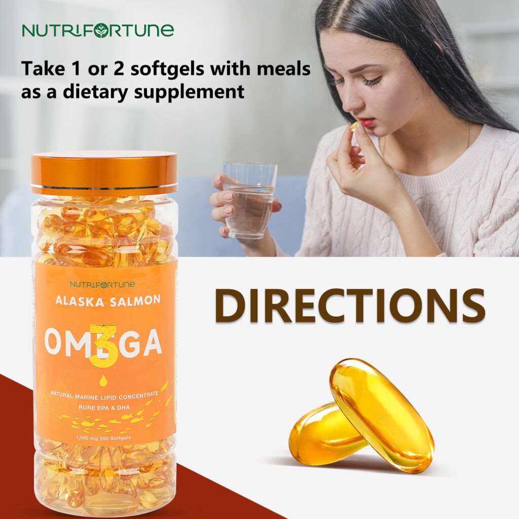
③ Dosage & Usage Guide
We included a “Directions” panel featuring a model taking the softgel with water, accompanied by text:
Take 1 or 2 softgels with meals as a dietary supplement.
This lifestyle integration reinforces ease-of-use and normalizes daily consumption.
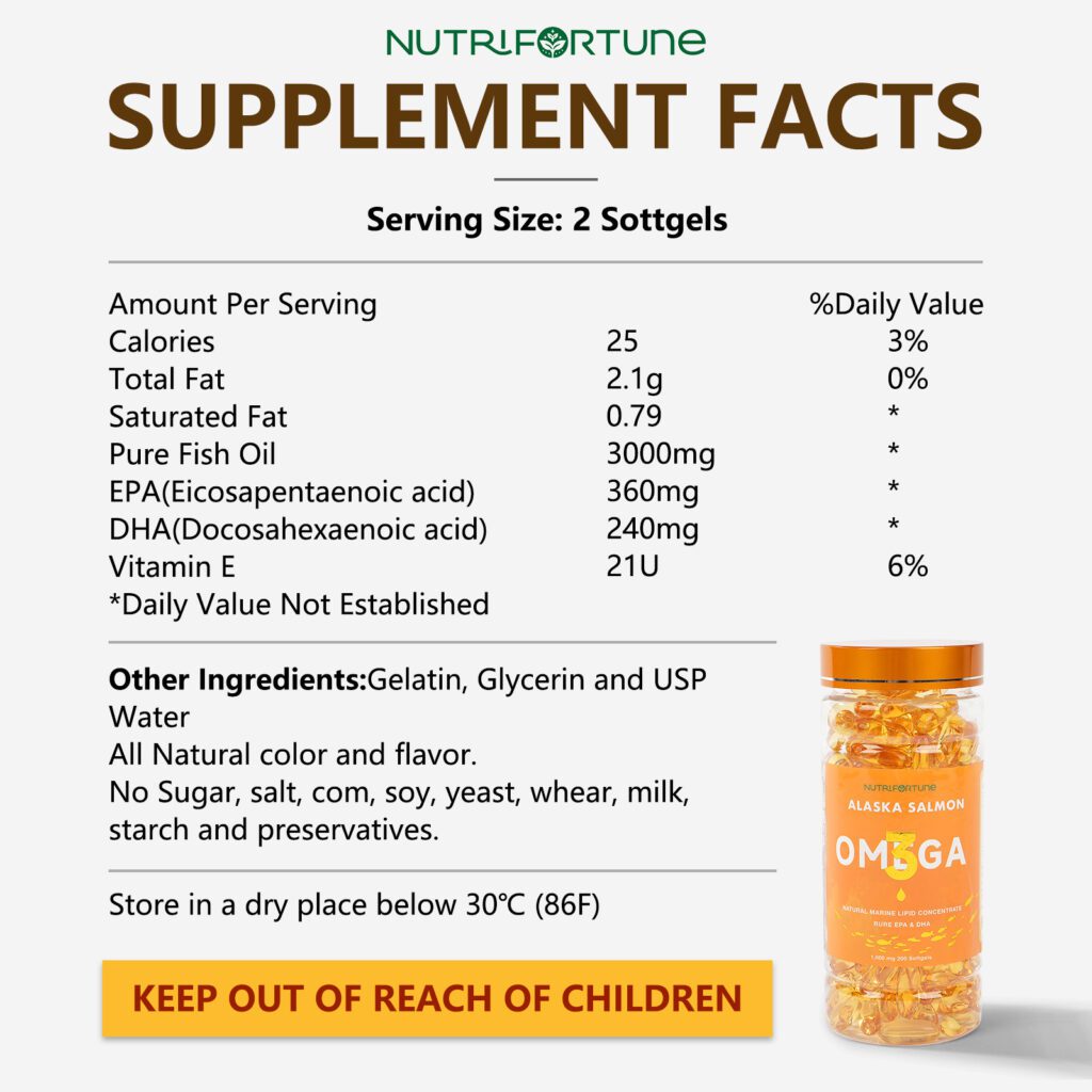
④ Supplement Facts + Allergen Transparency
A clean breakdown of serving size, nutrition data, and ingredient exclusions (no sugar, soy, gluten, dairy, preservatives) reassures cautious buyers. A bold safety label—KEEP OUT OF REACH OF CHILDREN—conveys professionalism.
⑤ Scientific Support, Consumer Trust
Visuals were chosen to balance emotion (family scenes, elderly couples, athletes) with technical credibility (ingredient closeups, supplement label, and capsule cross-section). This hybrid approach builds trust with both intuitive and rational buyers.
📱 Mobile-Optimized Layout
All visuals are vertically structured and font-scaled for mobile-first viewing. Core health claims and CTAs remain visible and engaging on every device.
💡 Brand Impact
This visual detail page reinforces NutriFortune’s position as a wellness brand that supports health across all life stages. From growing minds to aging hearts, the visuals walk consumers through the product’s full journey of impact.
👉 Want to turn your supplement product page into a trust-building, conversion-driving experience?
Web design is the “face” of an independent website, and at Airsang Design, we emphasize creating visually striking designs that align with the brand concept...
As the pet economy grows, the dog collar market faces intense competition. Consumers now prioritize quality, design, and added value over basic safety. With price...
Attracting users and keeping their attention is the key to high conversion rates and engagement. Mastering this is the key to creating memorable websites that...
In the increasingly fierce competition of cross-border e-commerce, having a high-quality independent website has become the key to brand success. As the world’s leading e-commerce...
Today we bring you the new logo design of the “Athena Art” dance training class! The design inspiration comes from Athena, the ancient Greek goddess...
YaZoo Pet Life Center LOGO design concept (2) Font designThe “YaZoo” brand name uses a modern and simple sans serif font, which has strong readability...
These 6 websites have different styles, there is always one that suits your aesthetic! Haus The Haus website is dominated by soft neutral colors such...


 30Apr
30Apr


")

